iZettle
My first client
Swedish iZettle is known these days for making it possible for anyone to take card payments. In 2011, when the company had only just started out, I was contacted to help with usability work and visual design for the public website.
A little piece of black plastic and a lot of belief in what you were doing
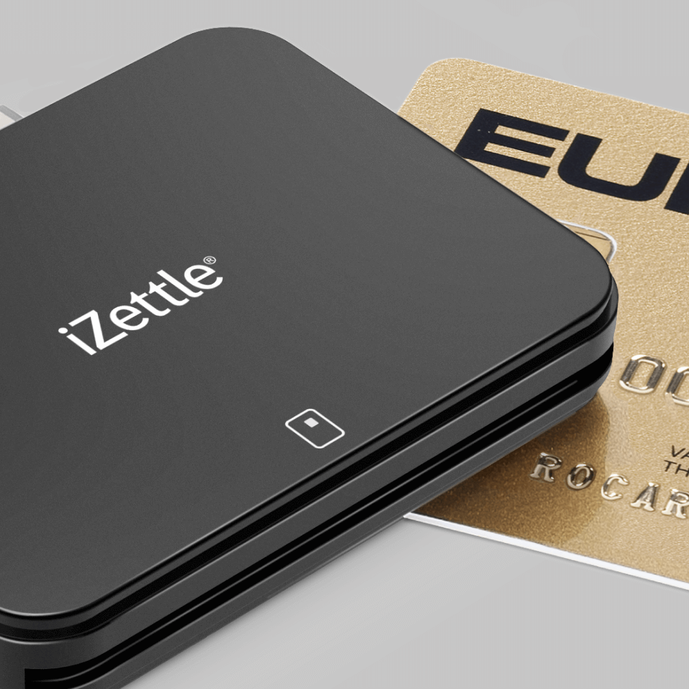
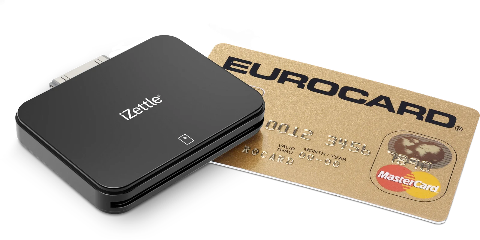
In early 2011, “taking card payments” meant heavy terminals, long contracts with system owners and expensive monthly fees. iZettle turned a piece of black plastic and an iPhone into a complete point-of-sale system. Ready for anyone to use. All that was missing was a website that could explain the whole thing clearly, simply and credibly.
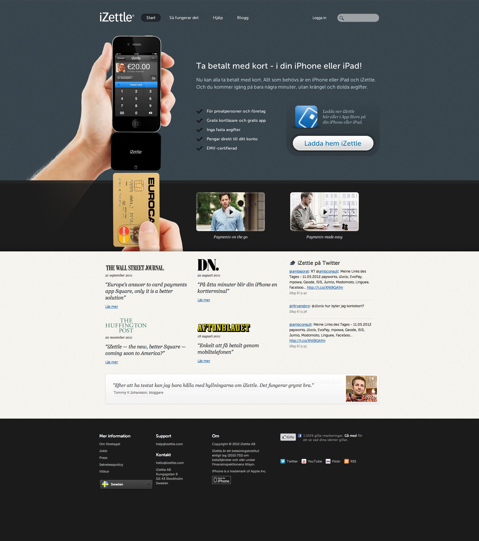
I was contacted about helping with exactly that: designing a site that could explain and sell the service publicly. Besides a straight information page with a sign-up form, there also had to be a service for everyone who used it — a till with all the information a café owner, say, might need.
Hardware on a pedestal
The iZettle card reader was the hero on every page. Clean product shots against a neutral ground, with plenty of air around them. If I remember right the overall design was settled in a day or so, but the iterations over which copy got to stay and which didn’t went on a good deal longer.
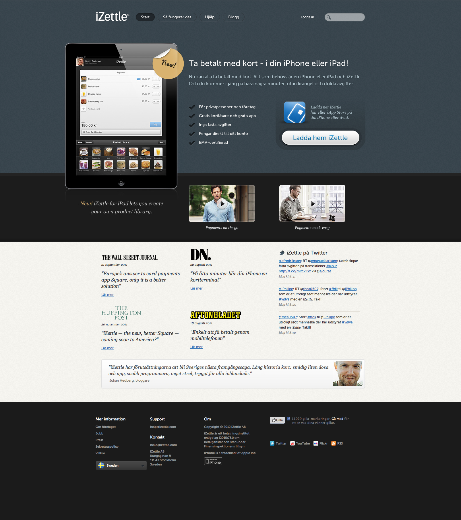
How the site looked when iPad support arrived
How things works. Not by Joe Kaufman.
The “Så fungerar det” page had to hold everything in a single scroll: who the service was for, whether you needed a card reader or not, social payments, security, and a realistic preview of the transaction view.
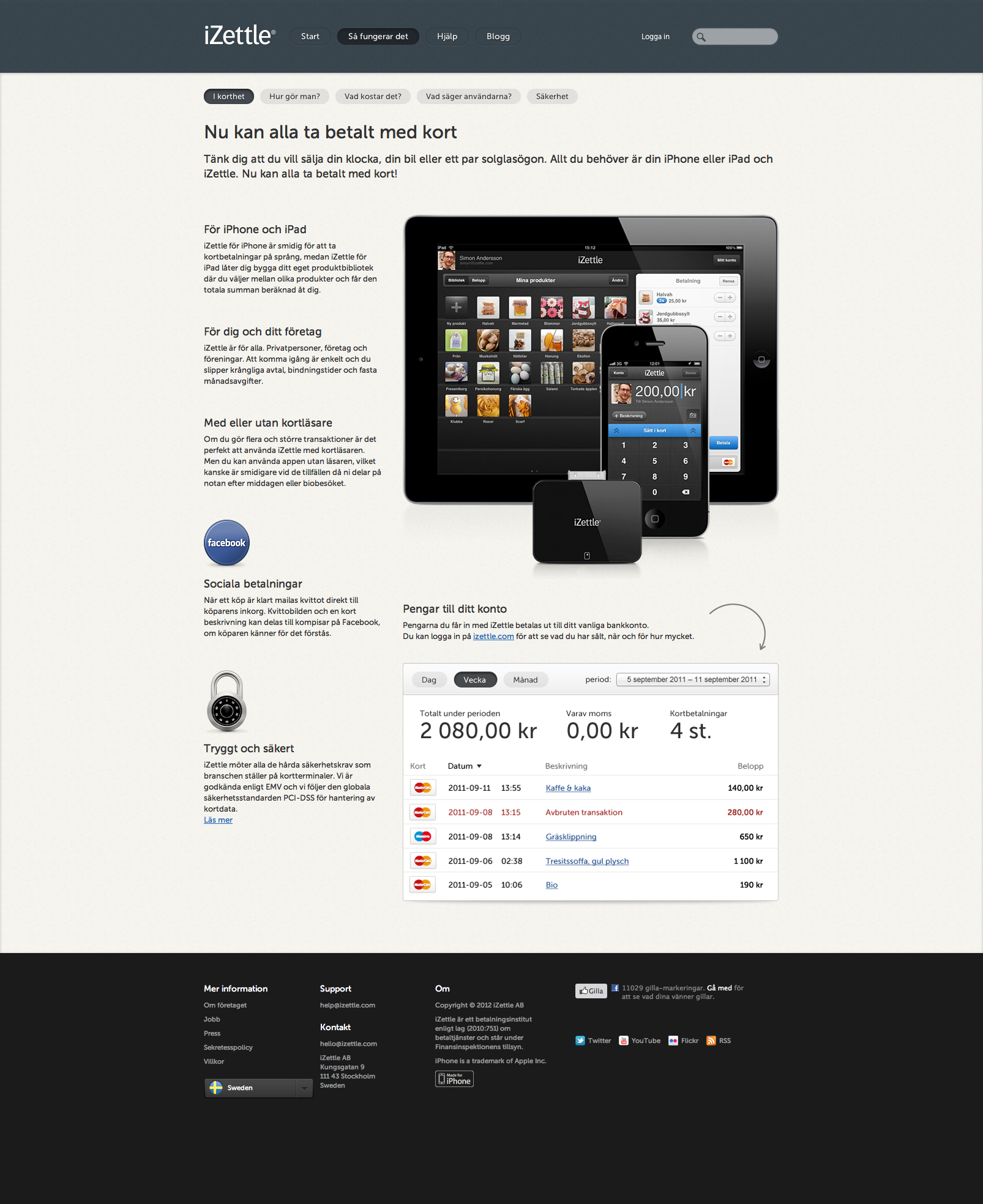
From sketch to finished page
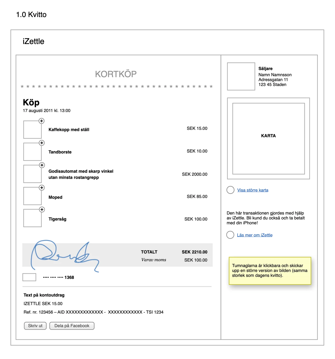
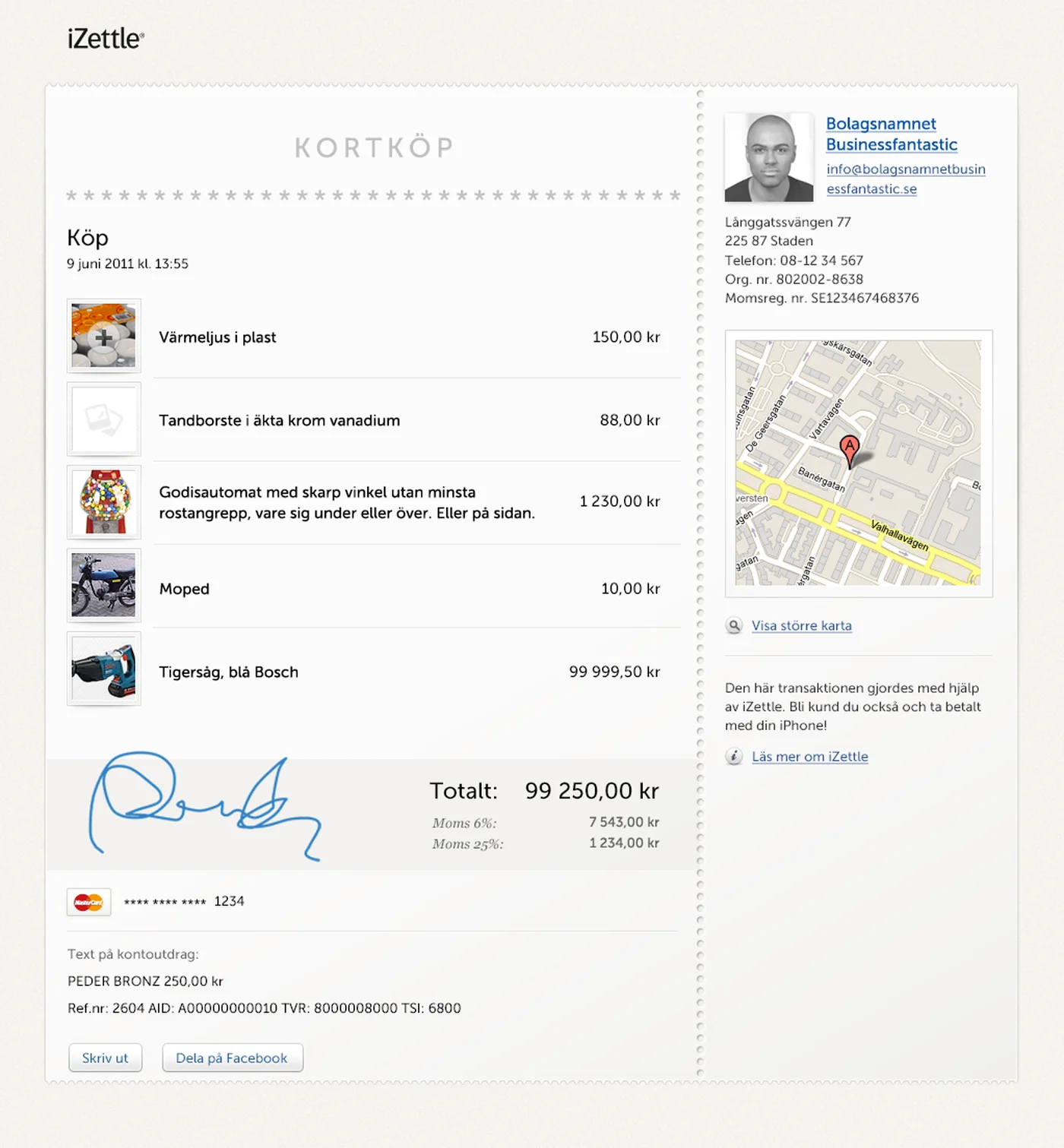
On the left, the wireframe as it went into the project: boxes where the images would go, “Namn Namnsson” in the seller panel, and a yellow sticky explaining that the thumbnails are clickable. On the right, the same page finished.
Communicating with developers
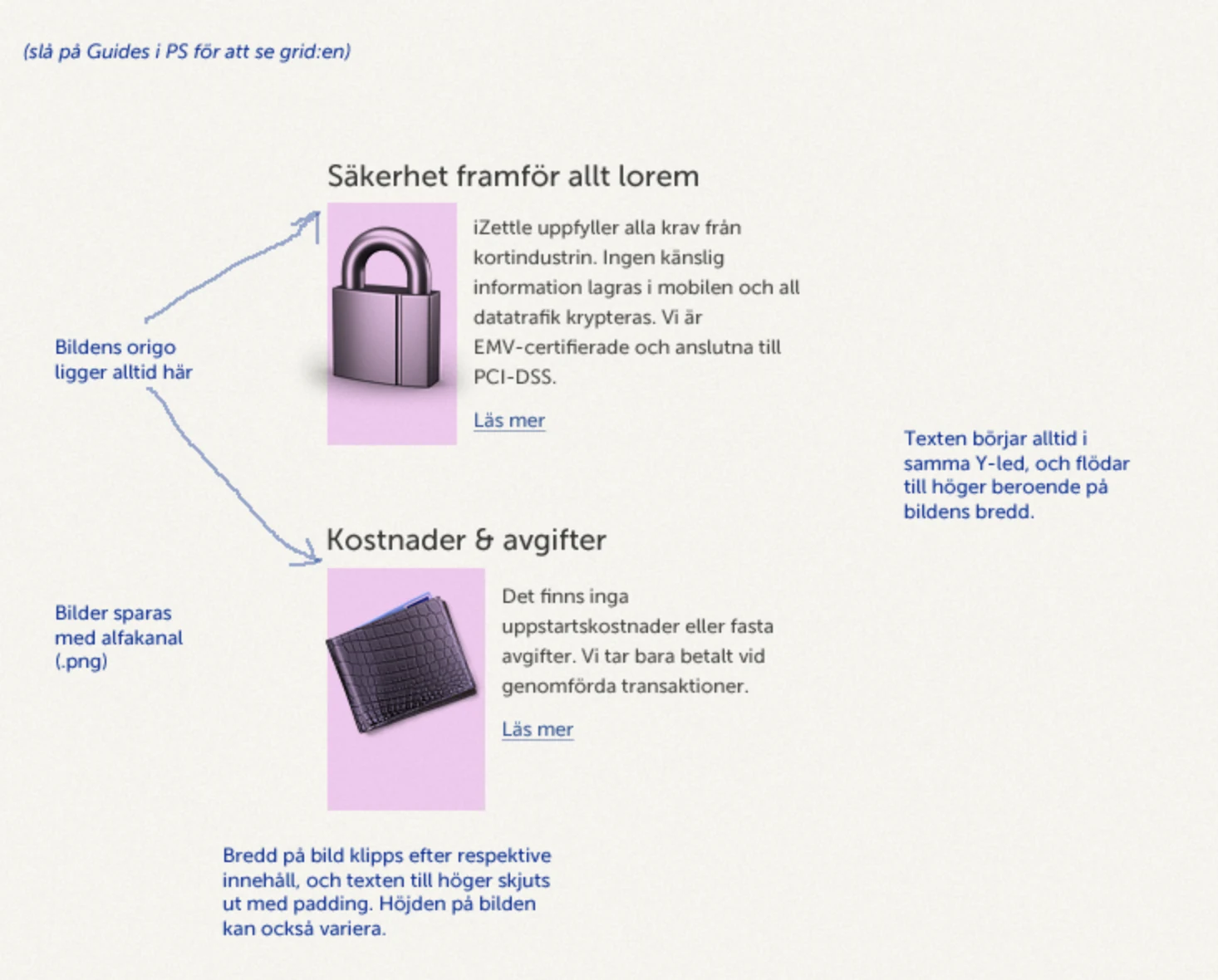
Before the site was coded, a lot of this sort of thing went to the front-end developer: a slice of the design with notes about what’s a rule and what may vary. Maybe not insanely modular in its specification, but it worked.
Old, but not that old
Looking at the design today, a lot of it is recognisable from how sites look now, and yet the project is very old. I can’t say I miss the overuse of shadows behind text, insets and highlights on graphic elements, though — but sure … too much flat design probably doesn’t make anyone happy either.
Working with the team at iZettle really was a highlight of my career. Very knowledgeable and pleasant clients, who went on to become one of Sweden’s most talked-about fintech companies, and were eventually bought by PayPal in 2018 for around 2.2 billion dollars.
The fork in the road a month or so into the project
Shortly after I started work on the project I was called into a meeting with founder Jacob De Geer, where he offered me a permanent position at iZettle. Incredibly flattering, but I had to say no. I’d only just dared take the step into working for myself, and if I’d taken the job I probably would never have got to go on that journey.