Conifer Vision
Brand and site from scratch.
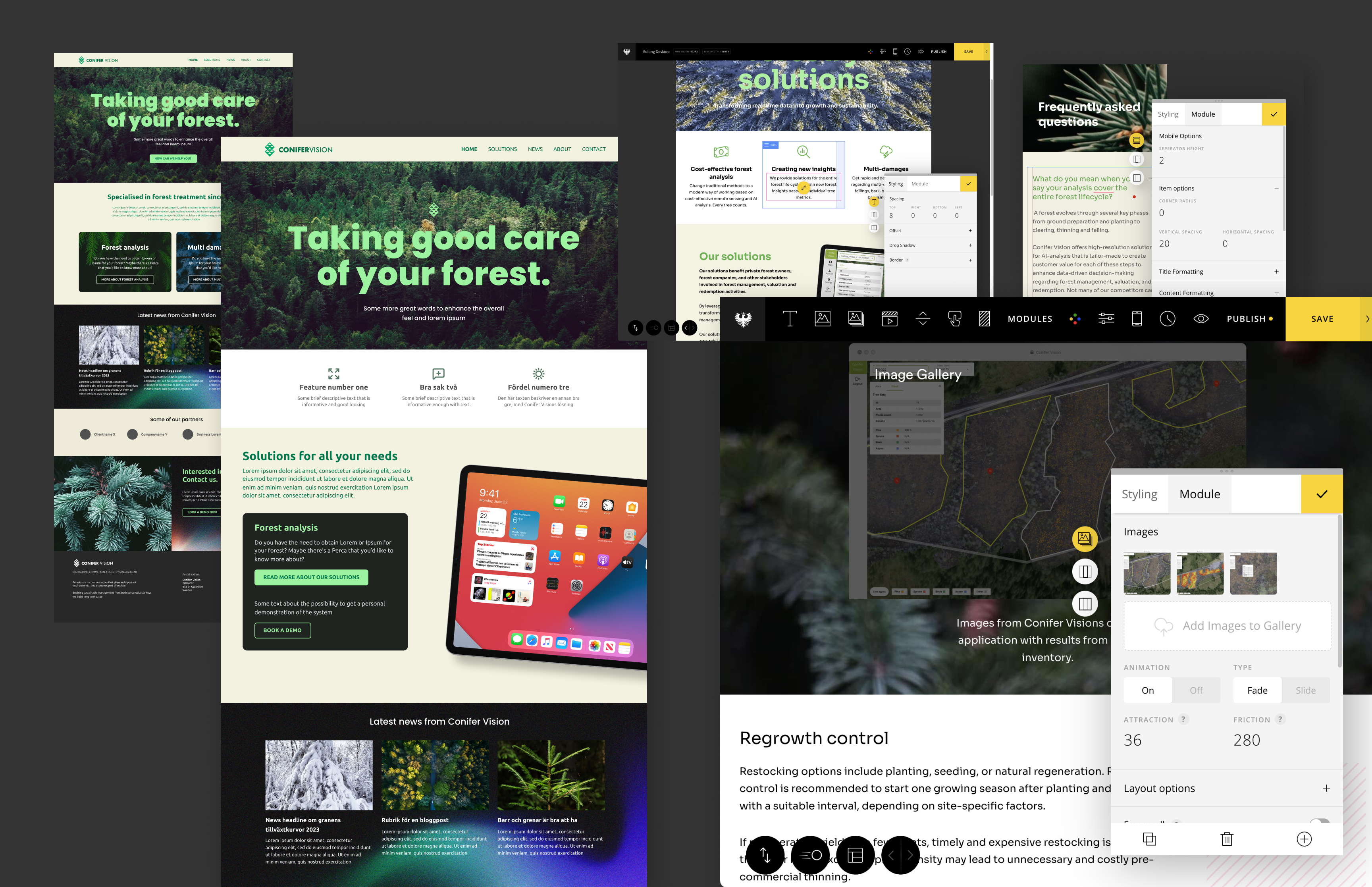
Conifer Vision is a Swedish company that helps forest owners get a grip on their forest — structure, health, storm damage and regrowth — by feeding high-resolution drone footage into AI models. I was asked to produce a new visual identity and to design and build a new website. The technical side was within what I could already do.
Finding a logotype that feels right
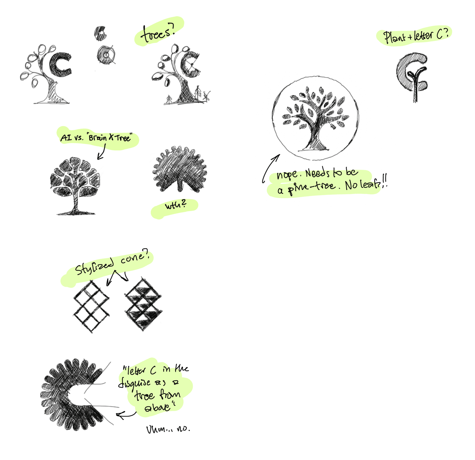
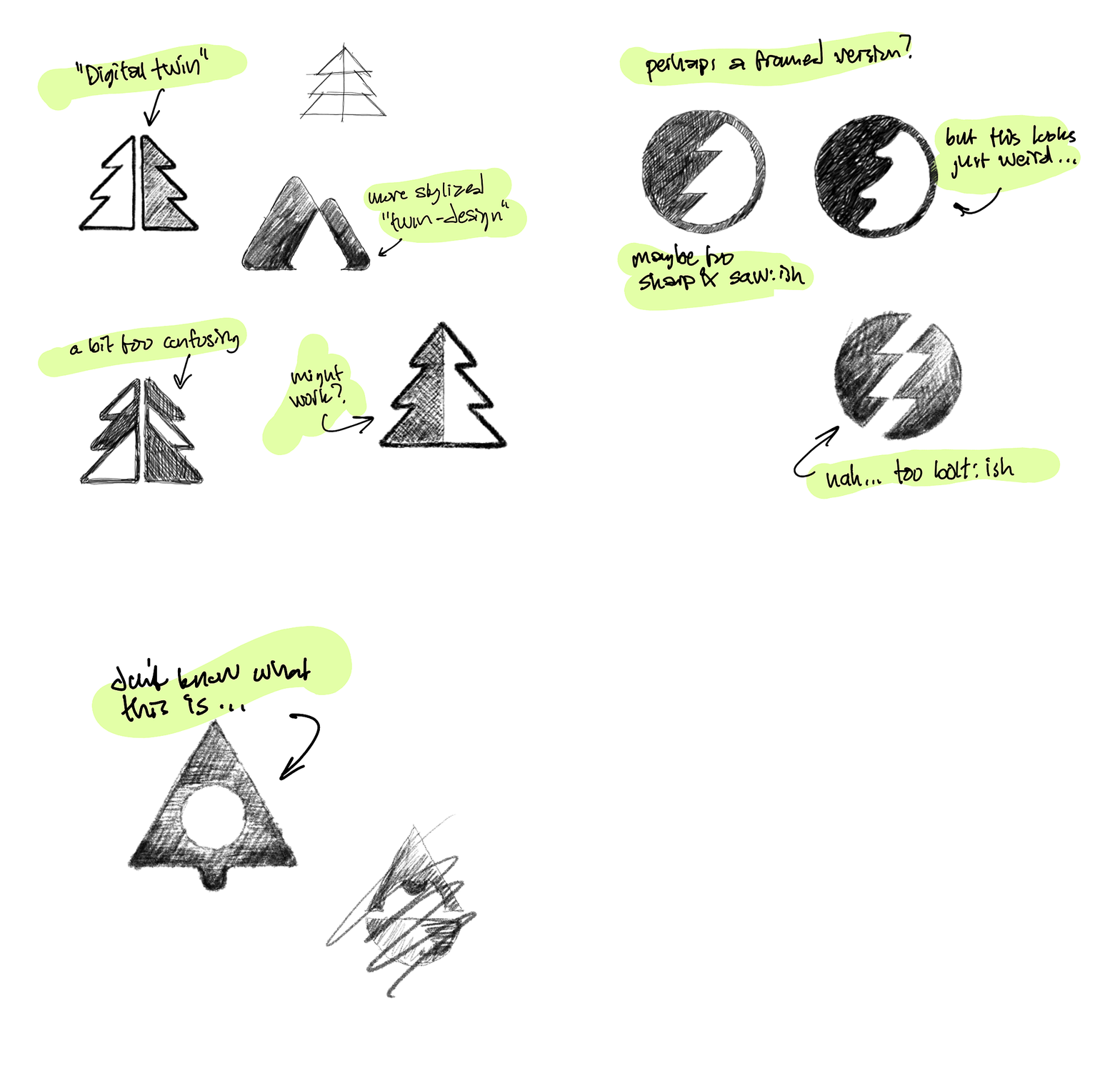
Where do you start? Trees? A spruce? Something AI-ish, whatever that would be? A cone? (“conifer” literally means “a tree that bears cones”.) The client mentioned they had a concept they called “a digital twin” — a digital copy of the real forest. That last one turned out to be what the whole identity would rest on.
Ideas I had plenty of
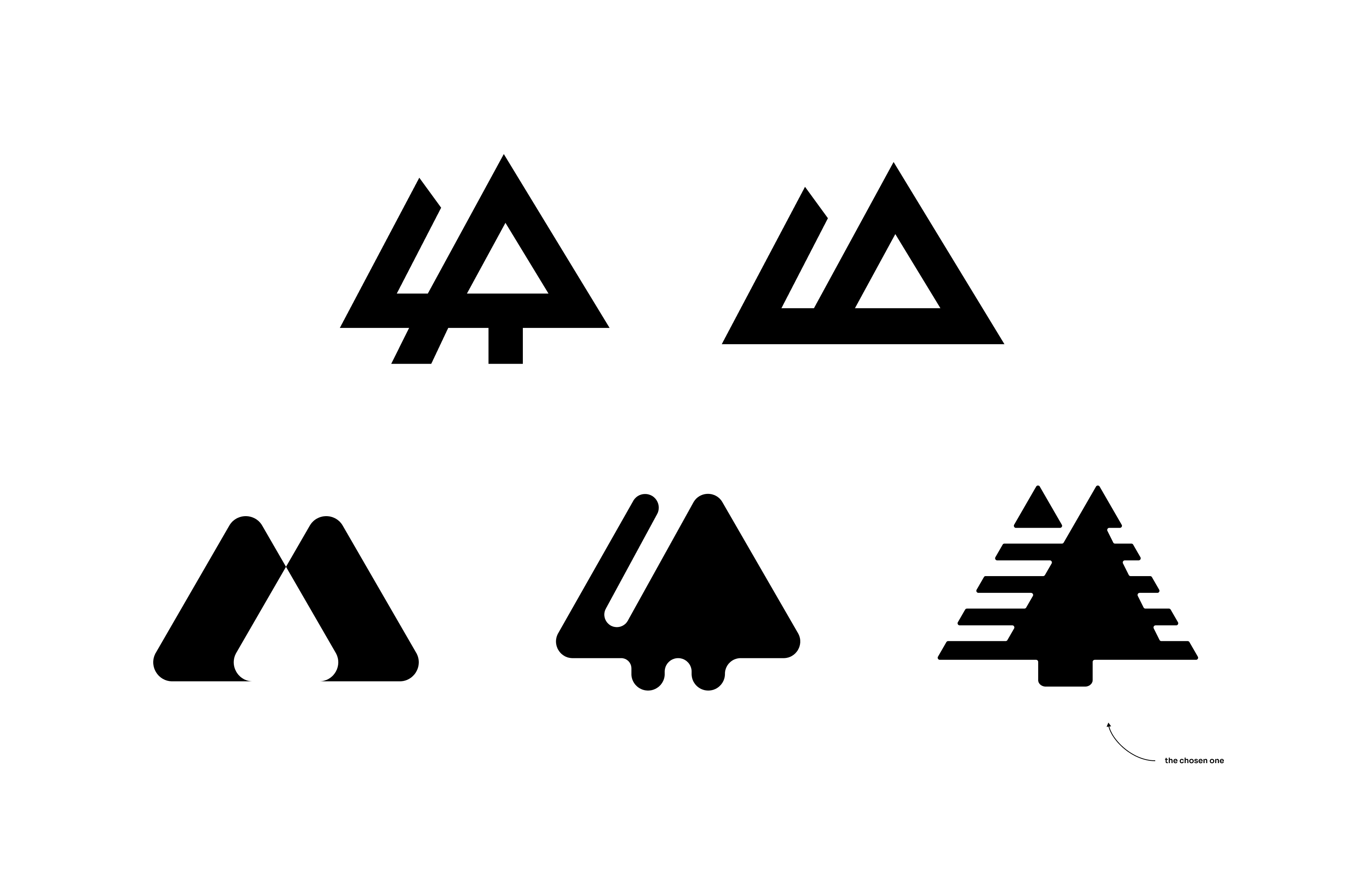
I started with a pile of hand sketches: trees in all their forms and a few stylised elements.
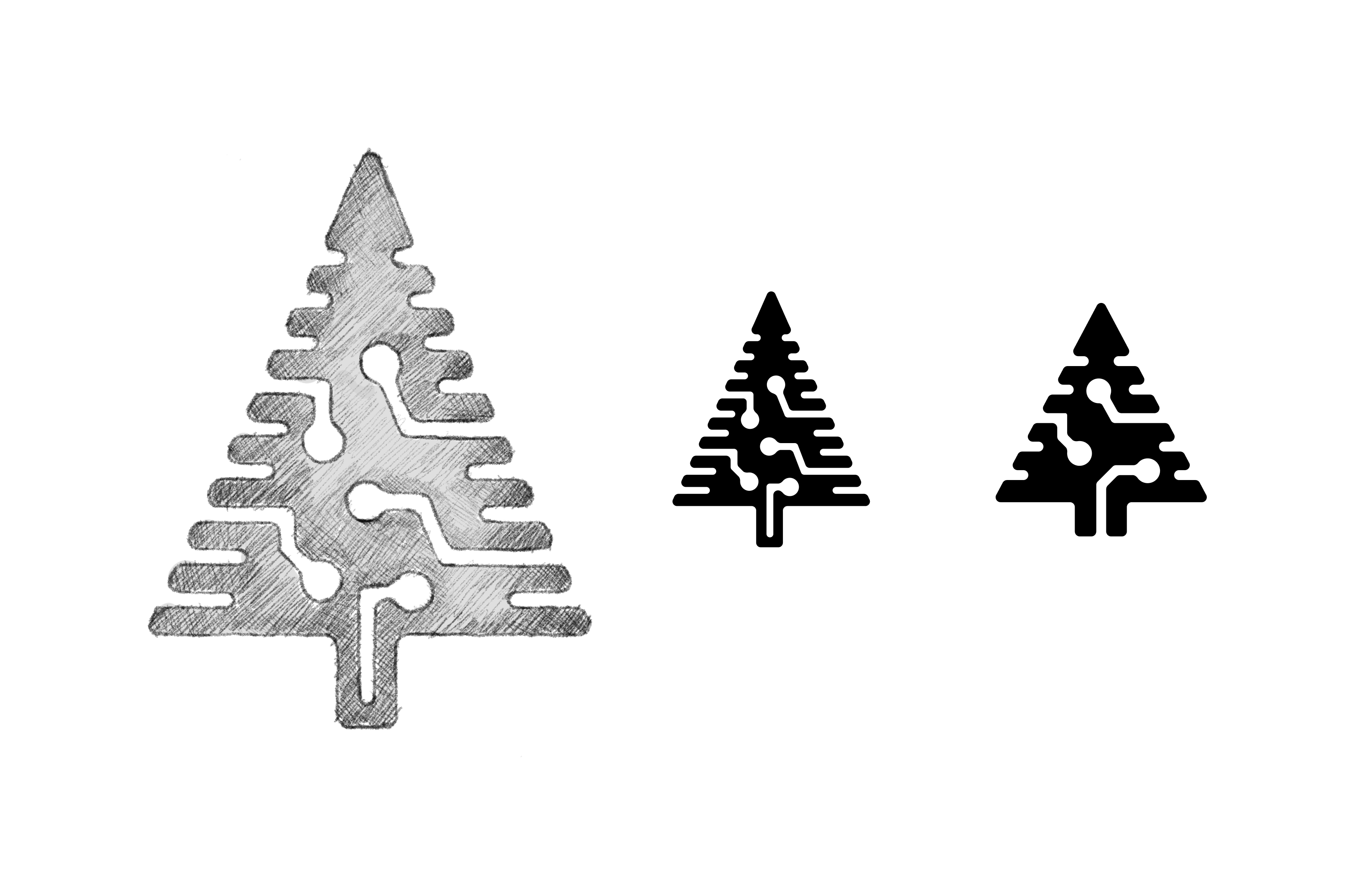
The circuit-board spruce
One idea I was fairly sure would be right: a symbol combining a tree with circuit-board-like patterns running through it. AI meets spruce, sort of. Sketched it, refined it — but the symbol mostly looked like a Christmas tree. Simplifying didn’t help. In the bin with it (as Sverker would have said).
More refinement & exploration
The search went on, this time towards something simpler. The digital twin stayed, but the tree became bars — like a digital readout of an analogue spruce. A few rounds with the client and we landed on what I, for lack of a better imagination, named “the raster bar tree”.
A small manual that holds it all together
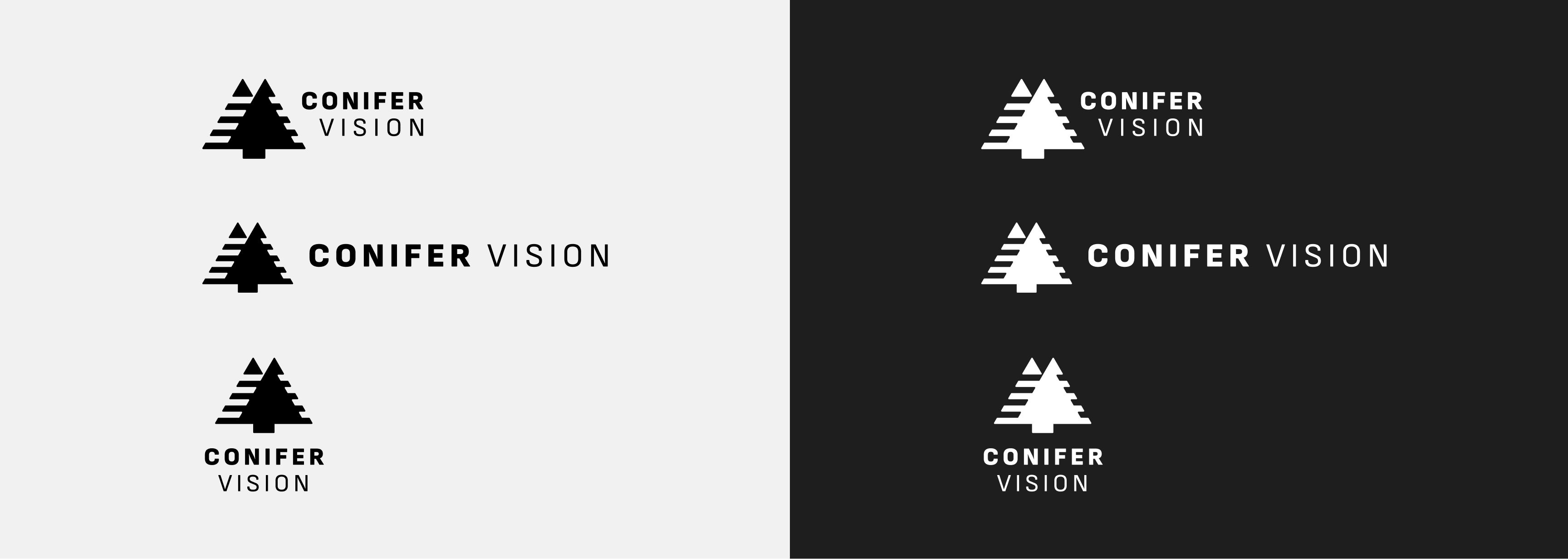
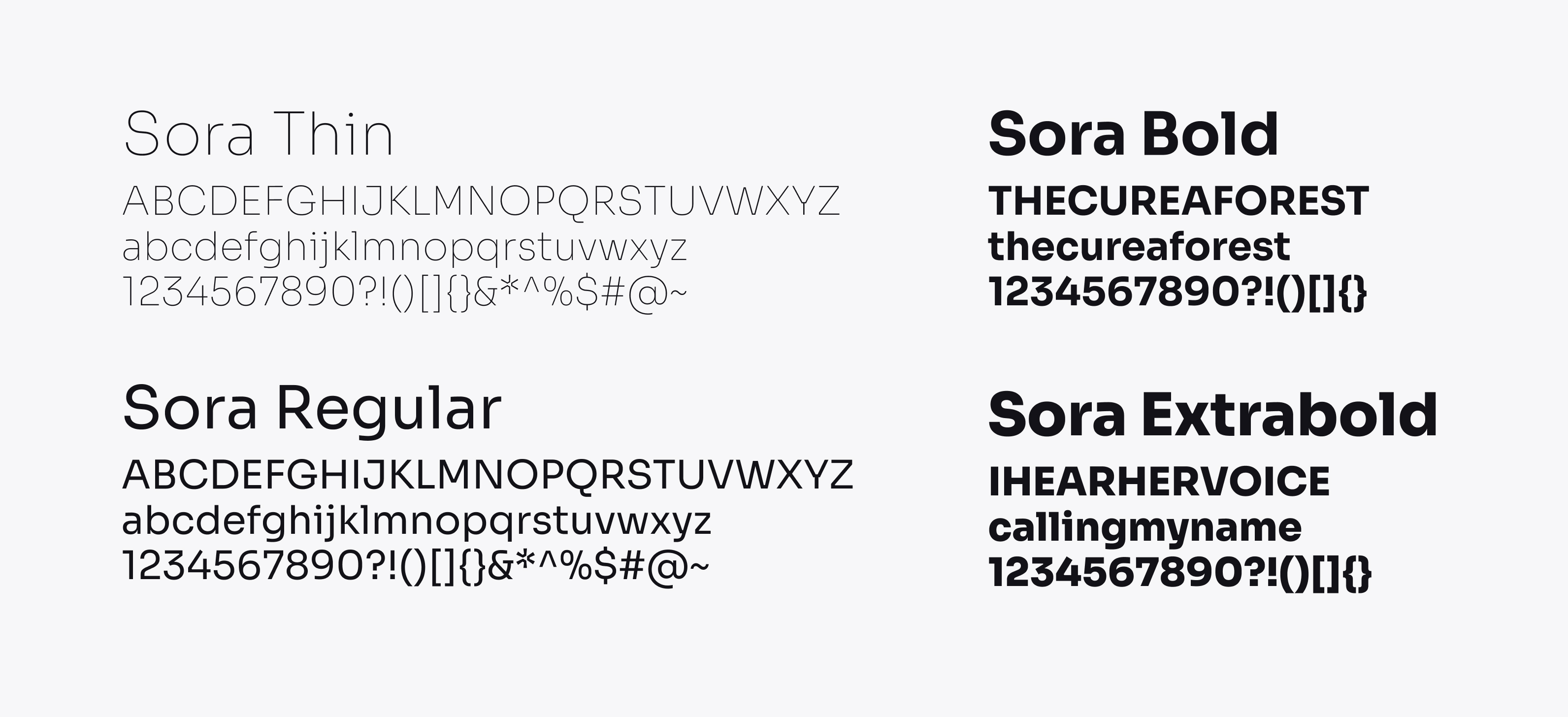
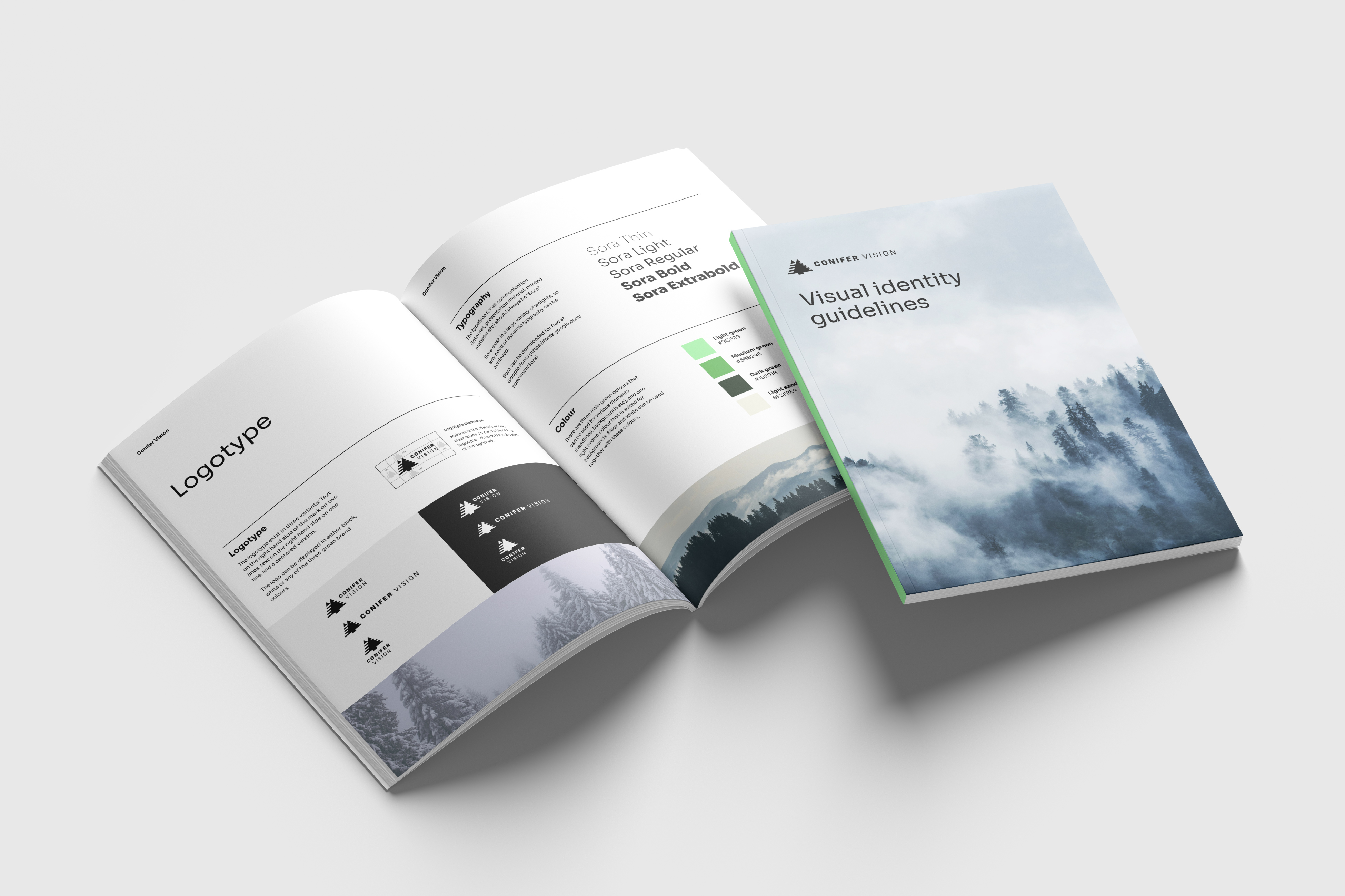
A short design manual captures the mark, the typography, the colour and the tone.
From wireframe to launched site
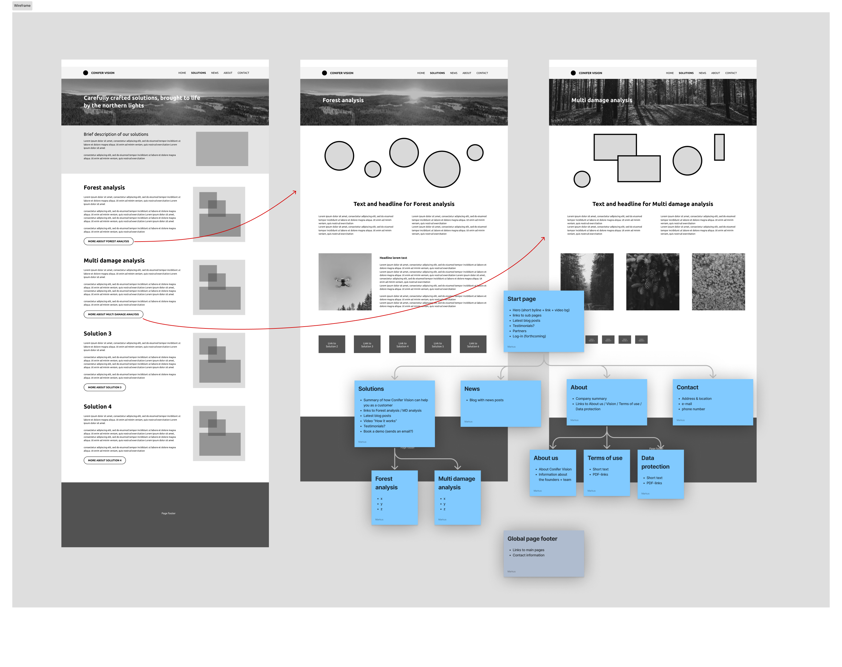
The information architecture and the content per page fell into place quickly — Conifervision.com is an information site, not a product. The service itself lives behind a login. I made a handful of visual drafts in Figma to find the right direction, then jumped straight into WordPress. Having a real, responsive beta to carry on working in is, in my experience, better than polishing still images forever.
One wireframe round, then Figma, then straight into WordPress
One round of wireframes sorted out the information architecture. Early Figma drafts then set the tone: how dark, how green, how much photography and how typographic. Once the direction held, I stopped designing in Figma and built the rest live in WordPress.
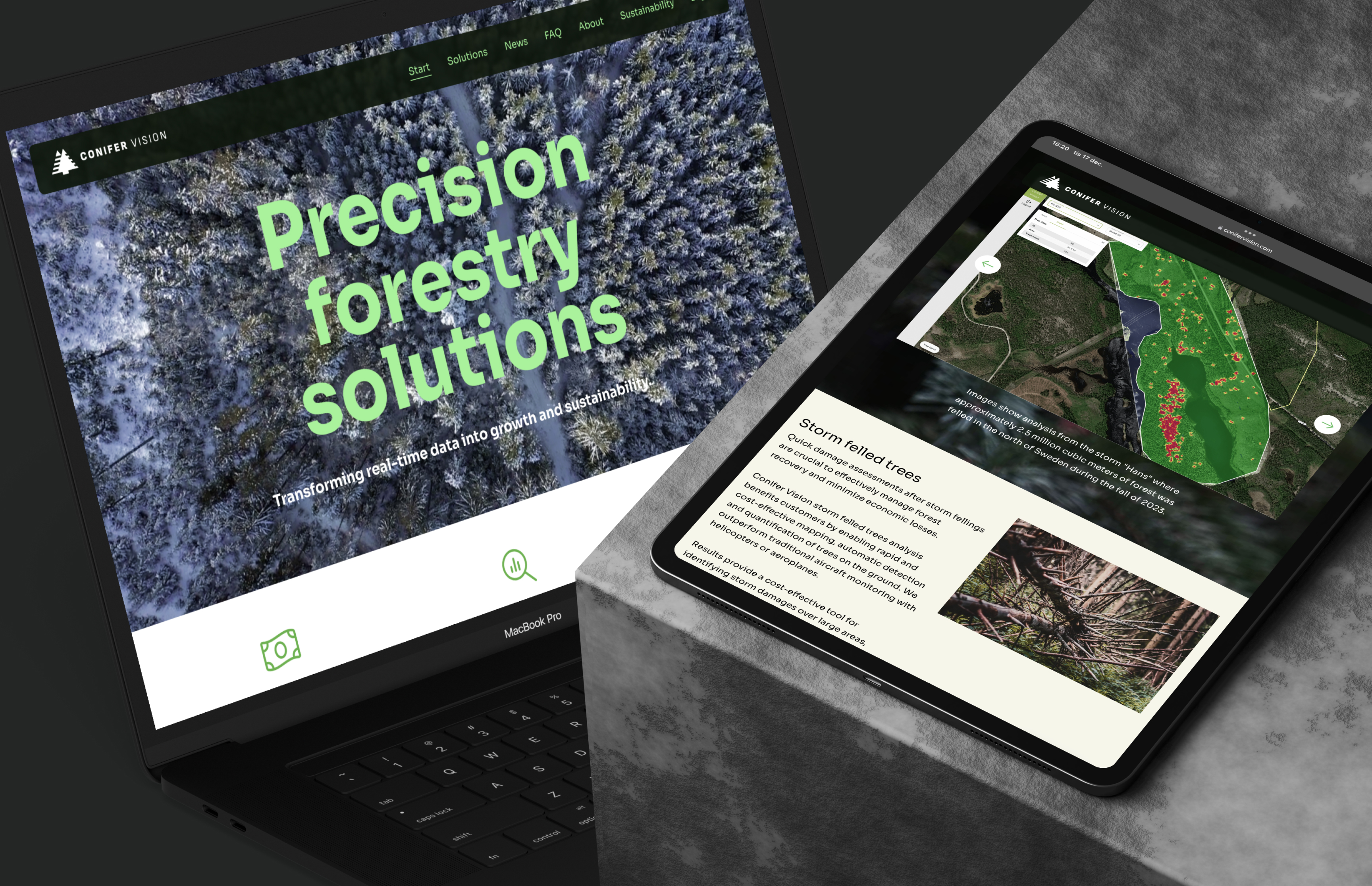
The site went live in early December 2024
It’s too early to know whether the site is doing its job, but the client was happy with the work.