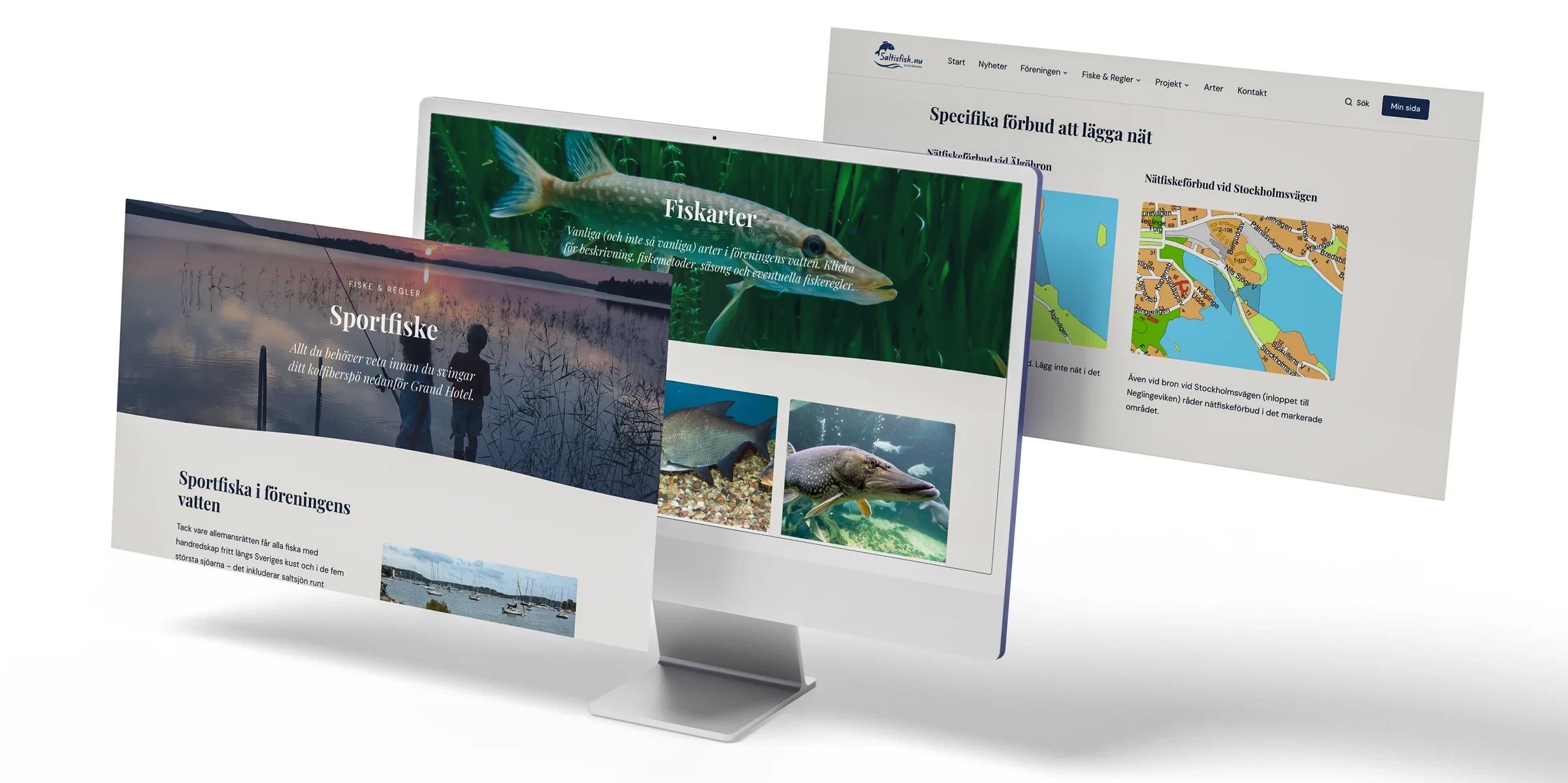
saltisfisk.nu
Website, CMS, payments and membership system for a society.
I sit on the board of Saltsjöbadens fiskevårdsförening and thought the website the society had needed redoing. Partly the dated design, but just as much how awkward it was to join — it took a great deal of handling by hand. What I wanted was a new site where you could sign up for membership easily, and where all the admin around members, sending newsletters, updating the content and so on went smoothly.
The old site
Nothing against the site the society had, but it was built on an early default theme with little room to say anything visually. The WordPress install also carried a pile of plugins that took a lot of time to keep updated, and a payment solution for the annual fees did not exist at all. To join, you sent in your details through a form and then made a separate payment by bank giro. The treasurer had to check every detail by hand and then send out an email with the membership number and the rest of the information.
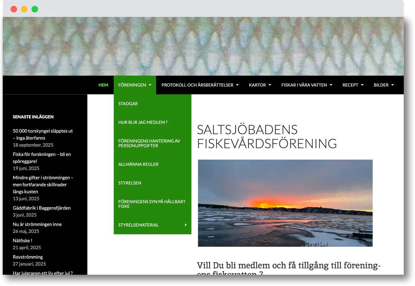
I started out with WordPress …

… but after buying and trying a few different WP themes (including my go-to theme Semplice), I realised that WordPress as a platform would mean far too much lock-in for what I wanted to do. Putting a payment solution in on top of that was a huge faff, and I also wanted an automatic link to a membership register.
A thought started to smoulder away in my head. Maybe I should build something completely new myself? Maybe something built on modern web technology and, well … optimised for the society’s specific needs? That settled it. Time to fire up the AI and rein in the horsepower.
Calm to look at, easy to find things in
The content is mostly news, and facts about the different ways you can fish here: rod fishing, net fishing and crayfishing. It had to be packaged so it was easy to get at, without a confusing navigation.
An identity with a personality of its own
The society’s logotype was nowhere to be seen on the old website, which it really ought to have been, but before I brought it out I had another go at how it looked. The fish (species unknown) had its gills and fins adjusted, and the wave more weight.
The old lettering in the logotype was set in a fairly dull Arial, and Arial makes anything anonymous. The name is now in Edu NSW ACT Foundation, a handwriting font that is even in weight, open and slightly retro.
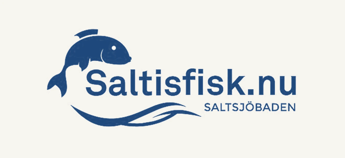
Handsome and tidy, for a news-heavy site
The site carries a lot: news, species pages, maps, rules and minutes. So the form had to hold back and let the content take the room.
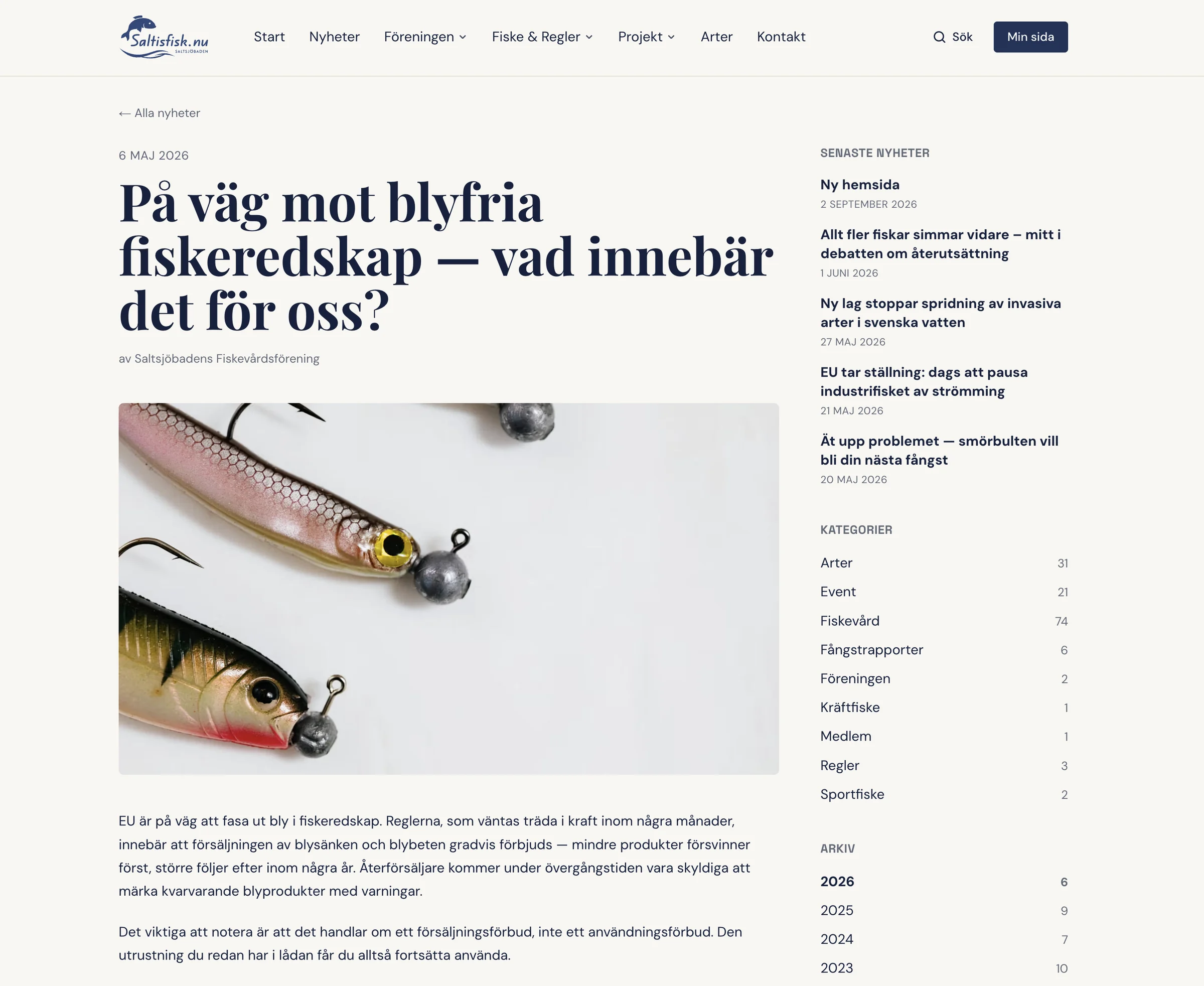
A column for the article, with the archive alongside
The news item was given a column of its own. Alongside it sits what makes the archive usable: the latest headlines, the categories and older news.
Most people read on a phone
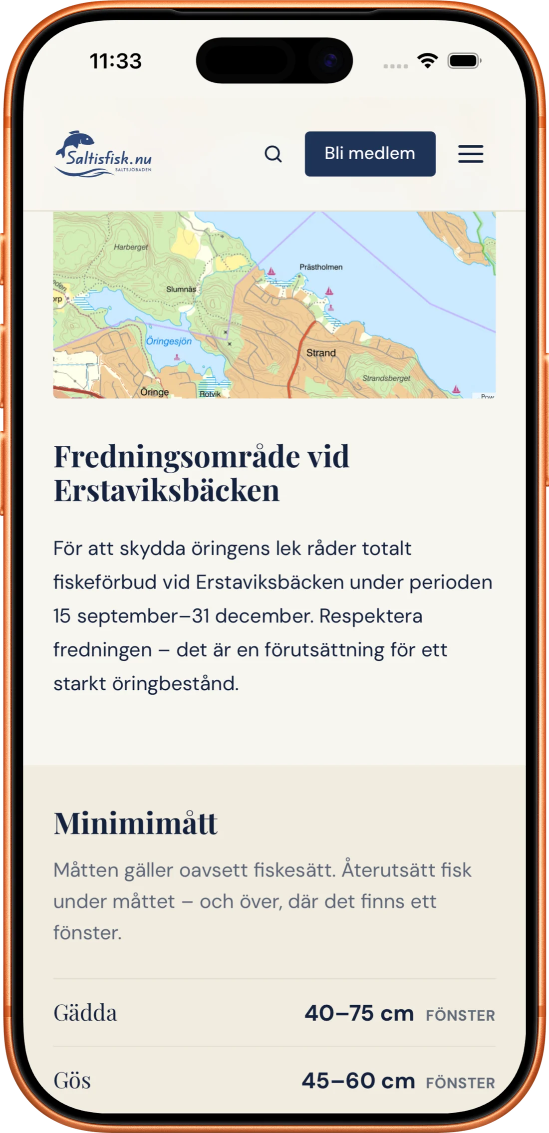
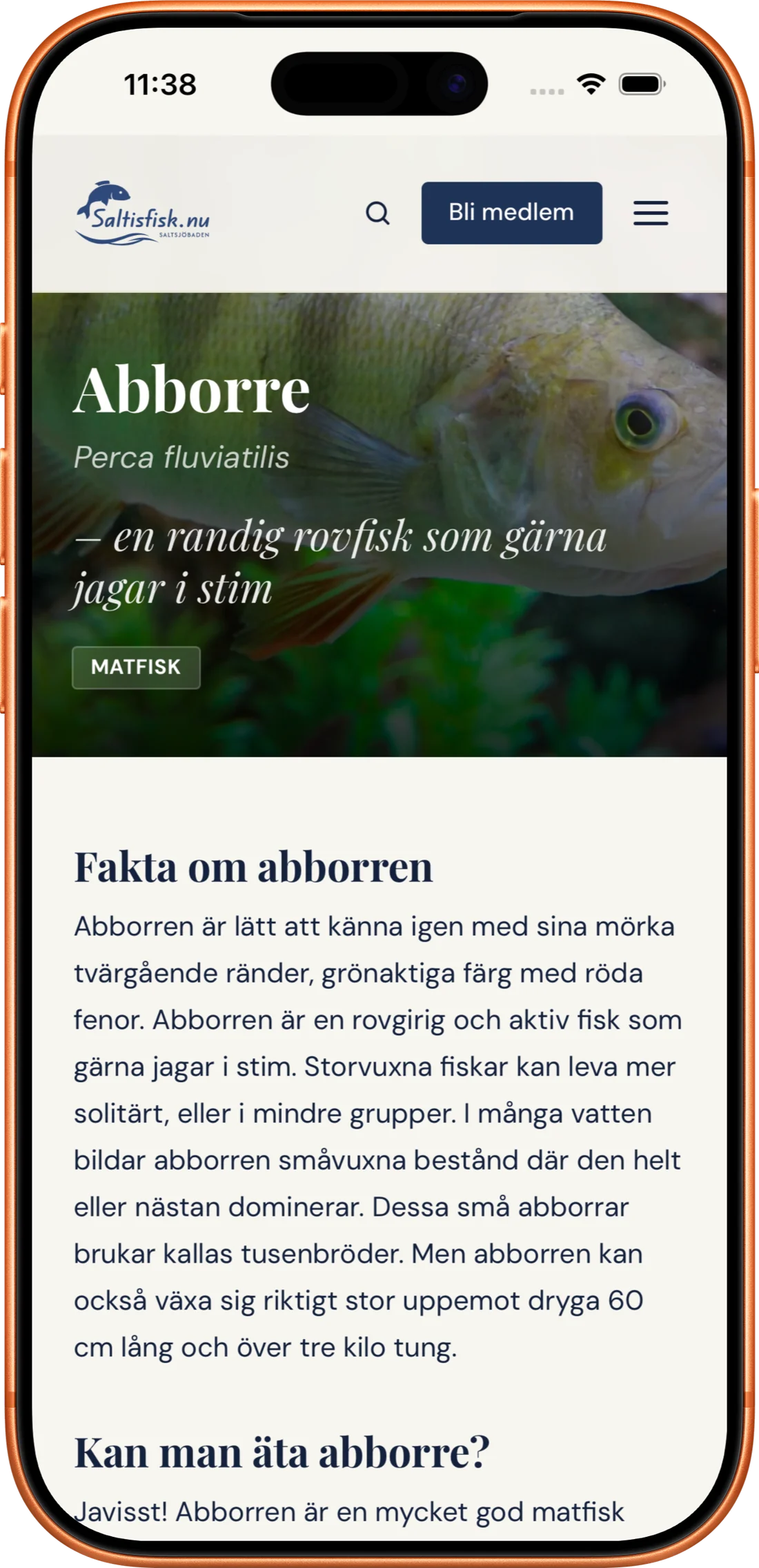
A lot of the information — the rules for the waters with their maps, the minimum sizes for fish and so on — you need to be able to read while you are out on the water, so a mobile-friendly site was important to get right.
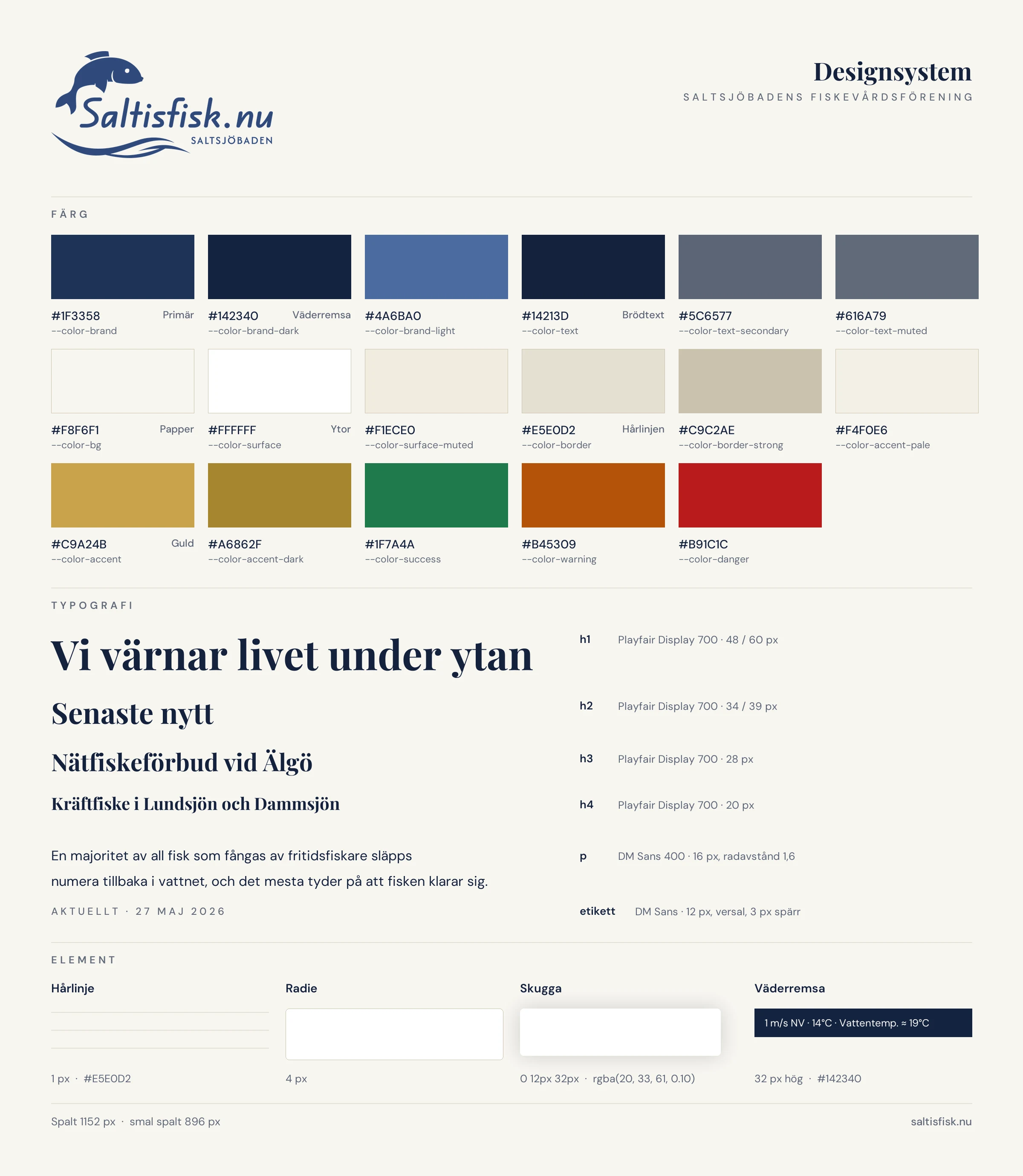
The whole thing on one sheet
The colours, the typography and the measurements that recur, collected as they appear in the published site.
Four manual steps became one
Before, anyone wanting to join filled in a form on the site, then paid the fee by bank giro on their own and waited. The treasurer had to check by hand that the money had arrived, and then email the member back. Now it all happens in one go, the way it ought to work.
The payment is the registration
Once you have filled in your details you pay 200 kronor by Swish, and then you are a member. I built the Swish integration in with a certificate of our own. When it has all gone through, the member is moved into the society’s register automatically. No checking by hand and no fuss for the treasurer to spend time on.
What the board can now do on its own
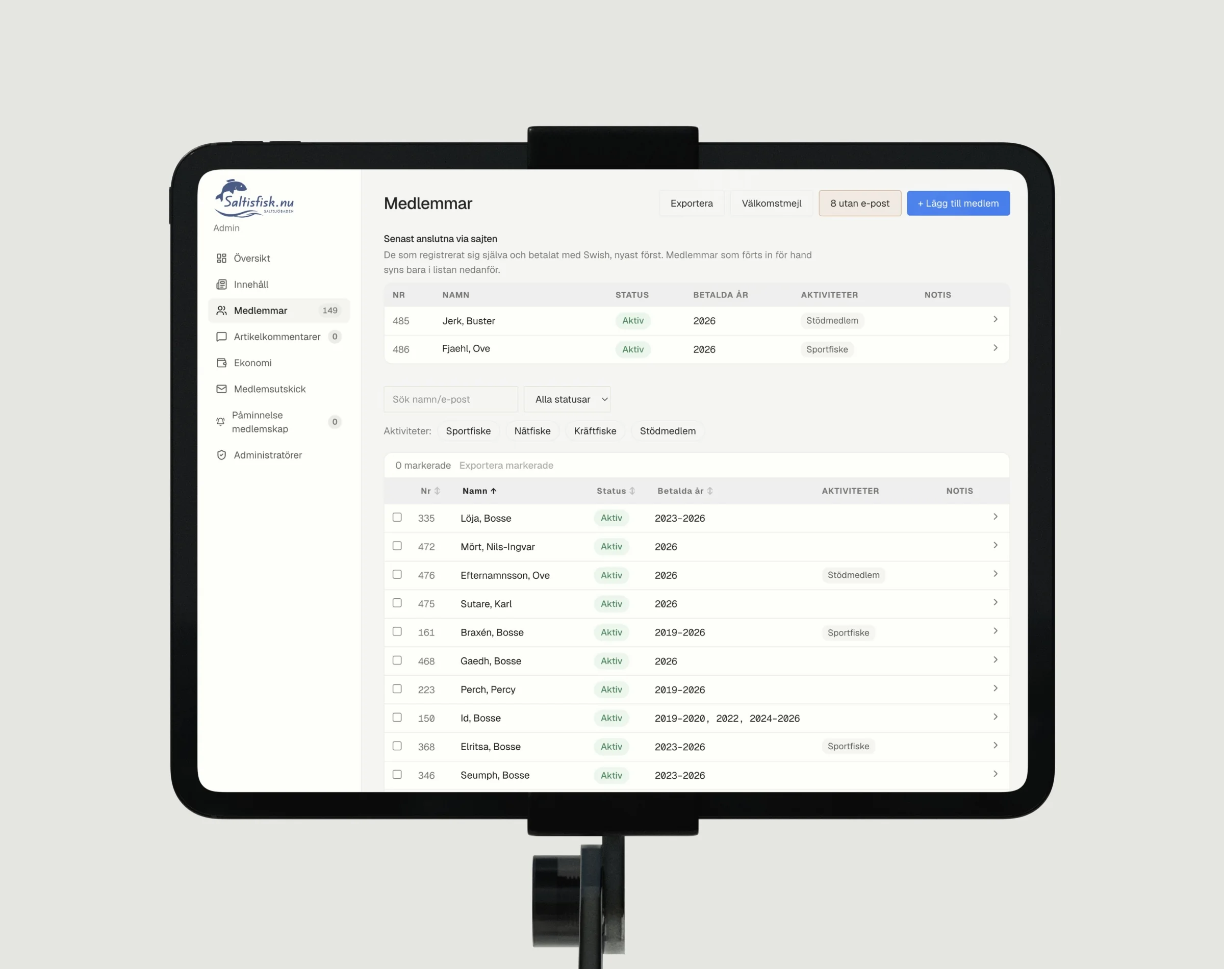
The members no longer sit in a spreadsheet on somebody’s computer, but in a GDPR-protected register the board reaches by logging in. The treasurer can change details, see which fees are missing and export what is needed. Newsletters are written and sent in the same interface, and all the site’s content is edited in the CMS.
- Membership register
- Search, edit and add members straight in the browser. The spreadsheet was imported once and need not be opened again.
- Membership fee
- See which memberships have not been renewed and send a reminder to the ones concerned.
- Finances
- Export payments and member data for the treasurer, in a format that opens in a spreadsheet program.
- Newsletter
- Write, send yourself a test copy and then send to everyone, or to a chosen few.
- Site content
- Editable pages, texts, images and colours in the CMS, with Swedish labels and a line of explanation under every field.
- Article comments
- Moderate comments from visitors to the site.
A full view of the content, the members and everything else
I built in different roles with different rights to see and change information. The treasurer, for one, has full control over every member, can pull financial reports and send reminders for unpaid fees. An editor can change all the content on the site, send mailouts to the members and so on.
Everything you can see can be changed
That the editing should be legible to someone who has never seen a codebase was a requirement from the start.
The site went live at the beginning of September 2026, and it took an hour before two people had found the site on their own and joined. Demonstrably working ✌️