Länsförsäkringar
A design system, a portal for insurance brokers, illustrations and the redesign of a CRM system.
I worked at Länsförsäkringar as a UX/UI consultant between 2018 and 2024, and got to take on a wide range of assignments: redesigning the group’s CRM system (Siebel underneath, to be turned into a modern front-end framework), a B2B portal for insurance brokers, a large body of illustrations for the public website, concept ideas & imagery, and a good deal more.
How do you draw … insurance?
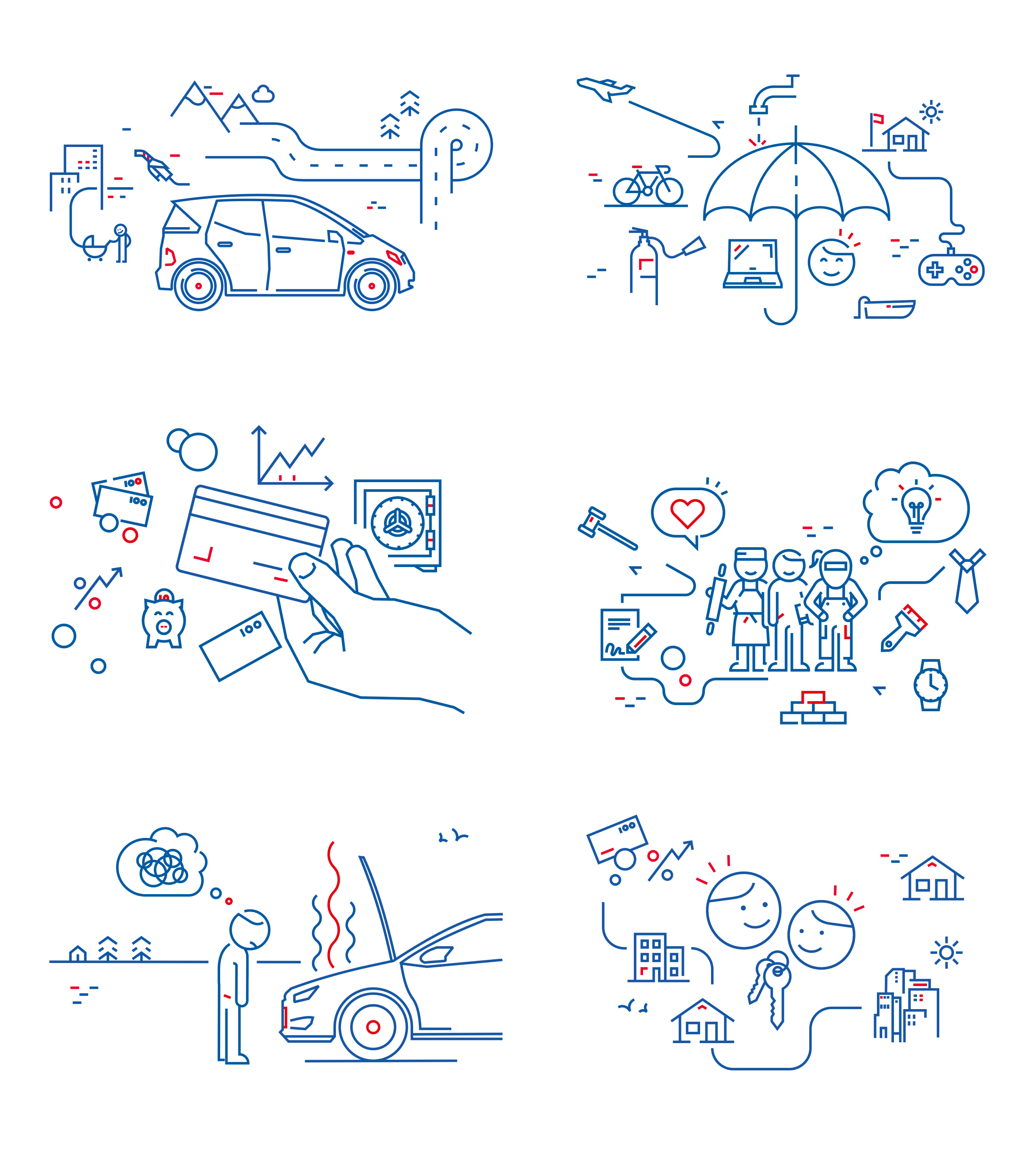
A redesign of LF’s various insurance pages created a need for illustrative elements that would sum up the area each insurance covered, without being too generic about it. Every illustration had to follow the brand guidelines (lines exactly 2 pixels wide, in either red or blue) and at the same time feel connected to the content itself.
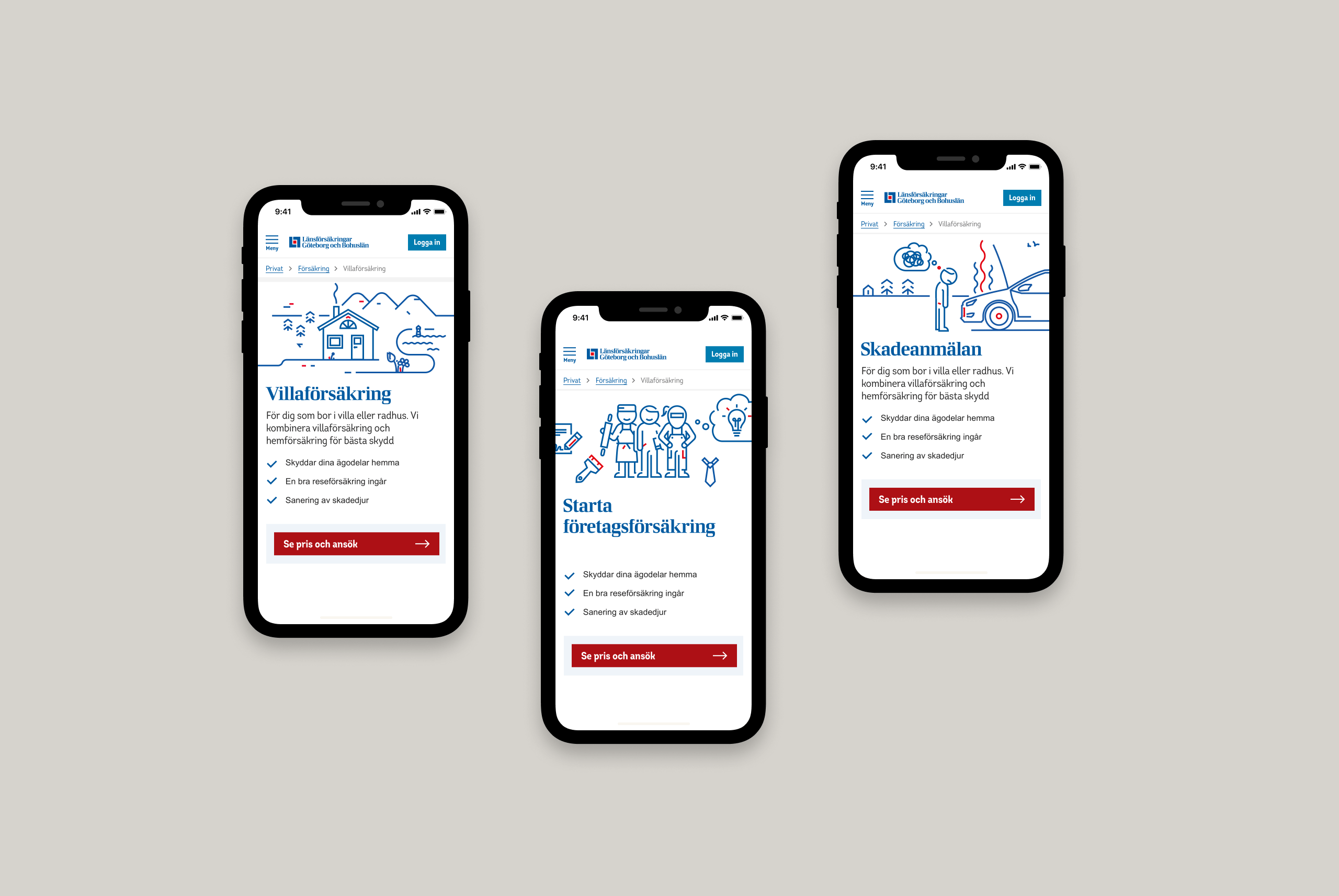
On mobile
Insurance information isn’t normally the most entertaining thing to read. I tried to keep the illustrations light, while still giving a tight frame that didn’t pull focus from the content itself.
The beginnings of Länsförsäkringar’s design system
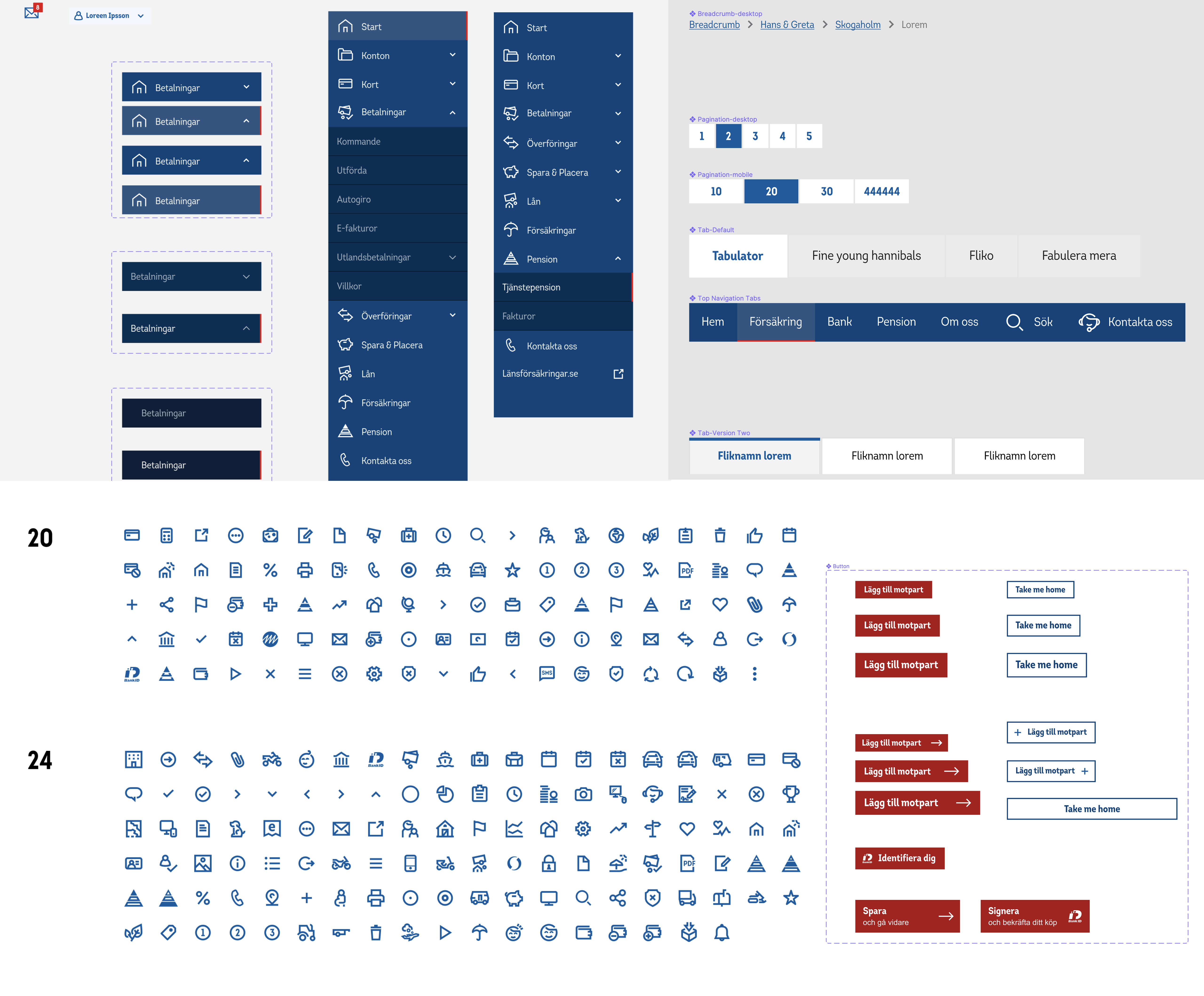
Around 2019 there was no design system anywhere in LF’s organisation. Some designers had started migrating from Sketch to Figma on their own, and whichever software you used, there was no shared design system or component library. Nothing formal, at any rate — the whole thing rested on people dropping Sketch libraries into a shared folder on the network for other designers to pick up.
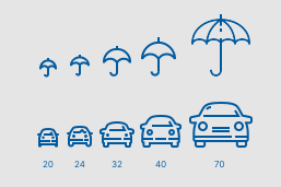
One day I lost it over the lack of a consistent icon library. The particular thing about LF’s icons is that you can’t scale the sizes up and down, because every icon has to have the same stroke weight. And they needed to exist in a whole pile of sizes (20×20, 24×24, 32×32, 40×40 & 70×40 …). Normally you’d have solved that by resizing the icon, but here I had to redraw every single one by hand. More than 500 of them. It took a little while …
Visualising an internal concept
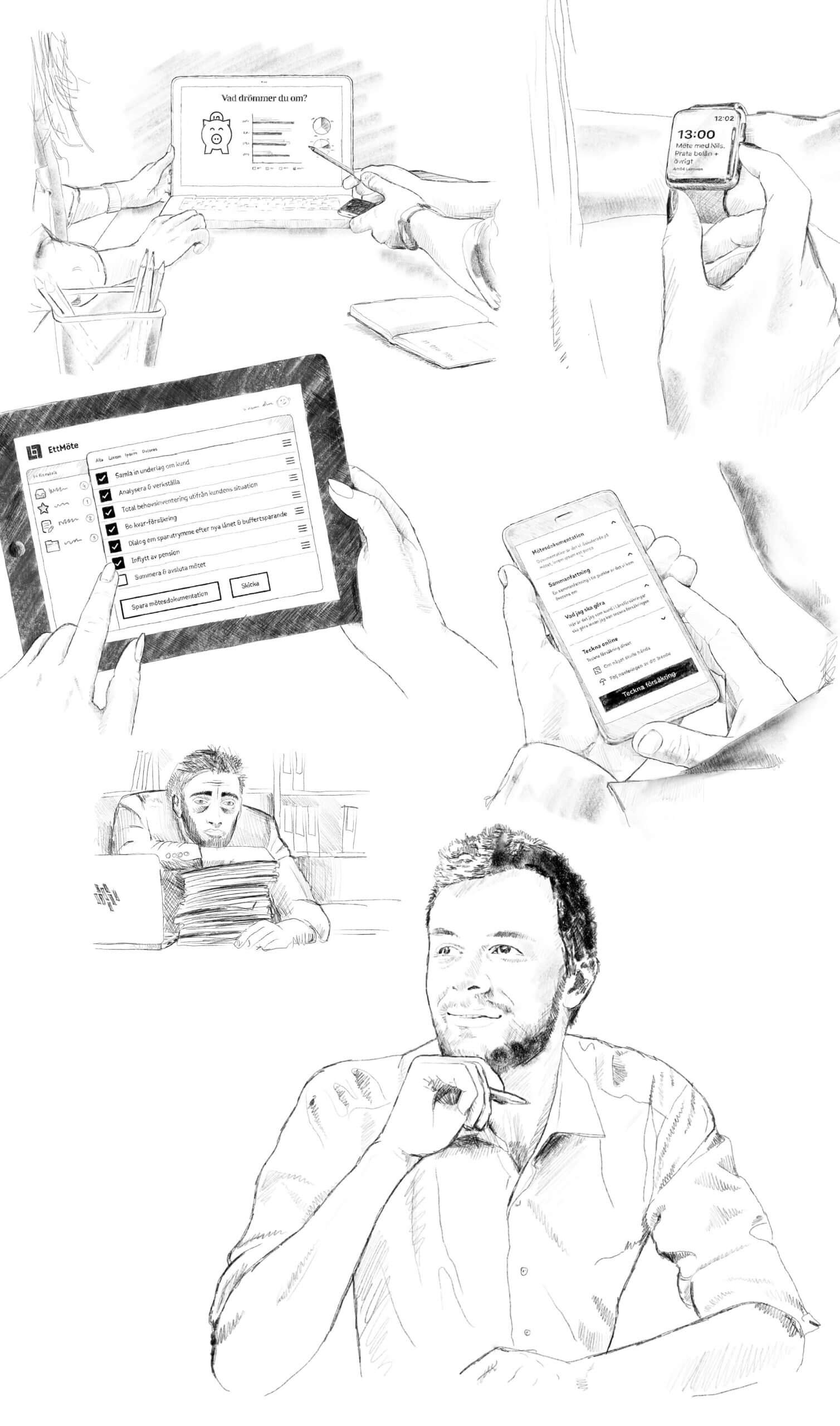
Sometimes I got to work on things that weren’t meant to (or needed to) follow the brand guidelines at all. Once I was asked whether I “could draw a few conceptual images explaining a future way of working”? Of course I could. The result was a series of hand-drawn images showing moments from an employee’s day — both as it was then and in a possible future.
A website for brokers, not end customers
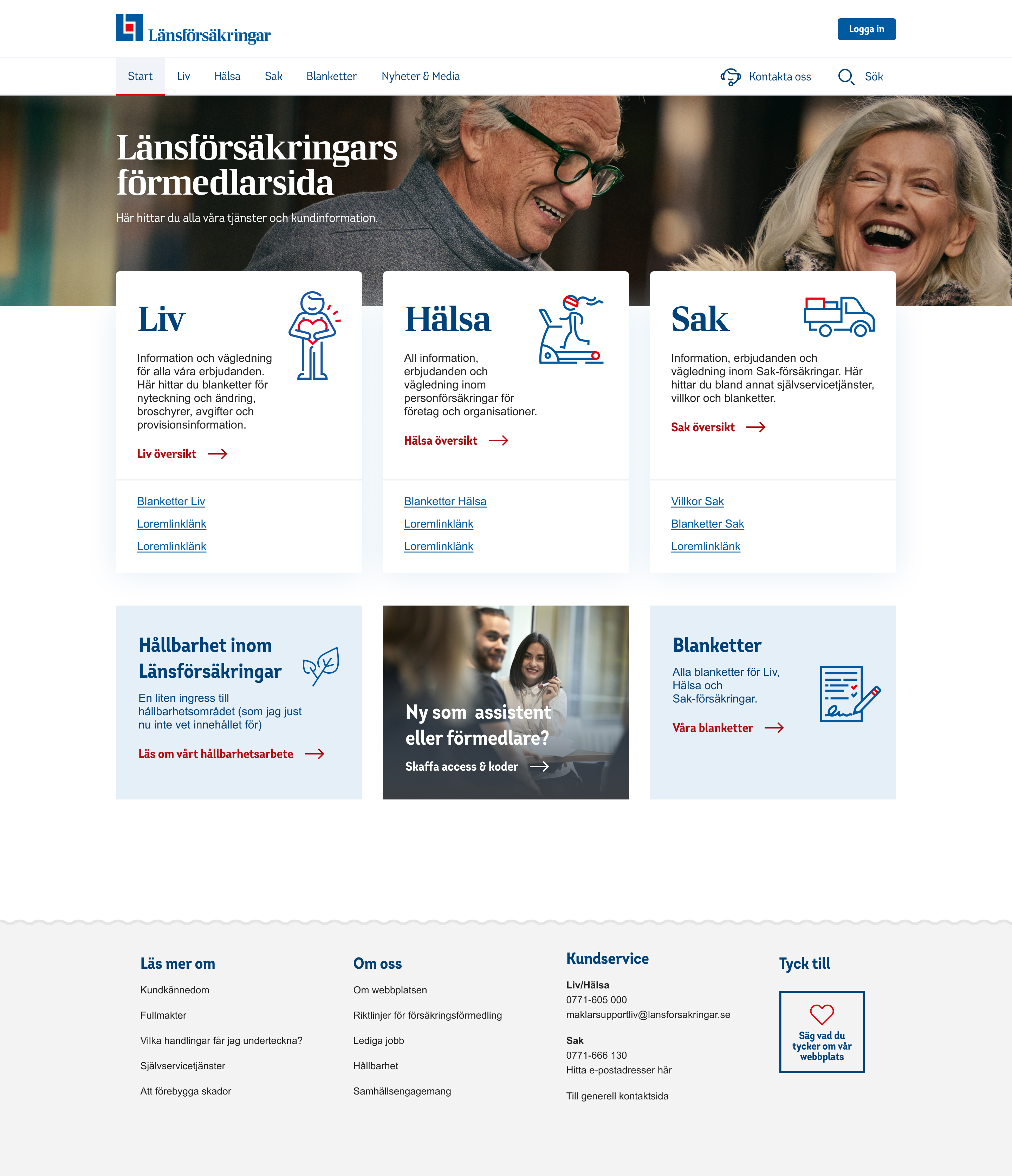
Länsförsäkringar distributes a range of products and services that independent insurance brokers in turn present to the end customer. Förmedlarsidan is where those brokers go for information and knowledge about those services, and I got to recast a neglected website and put in a series of features that made it easier to find the right information.
From start to finish (as the saying goes)
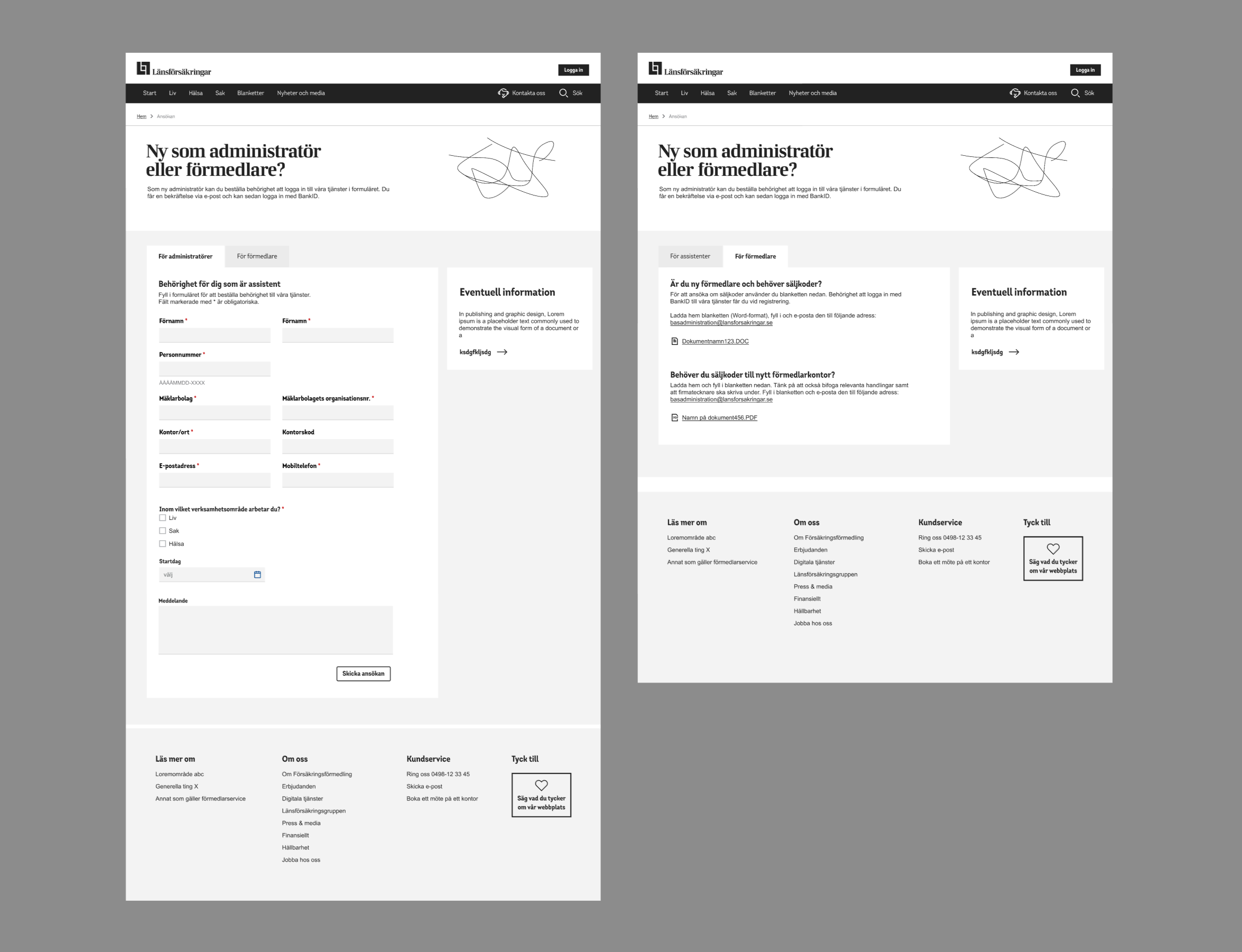
Drawing wireframes is (or at least was) the right way to move a design process forward. Partly because it’s quicker to sketch out a flow in “boring” grey views, but you also gain from the recipient or client not getting stuck on design details at the wrong moment.
A trial run with the users
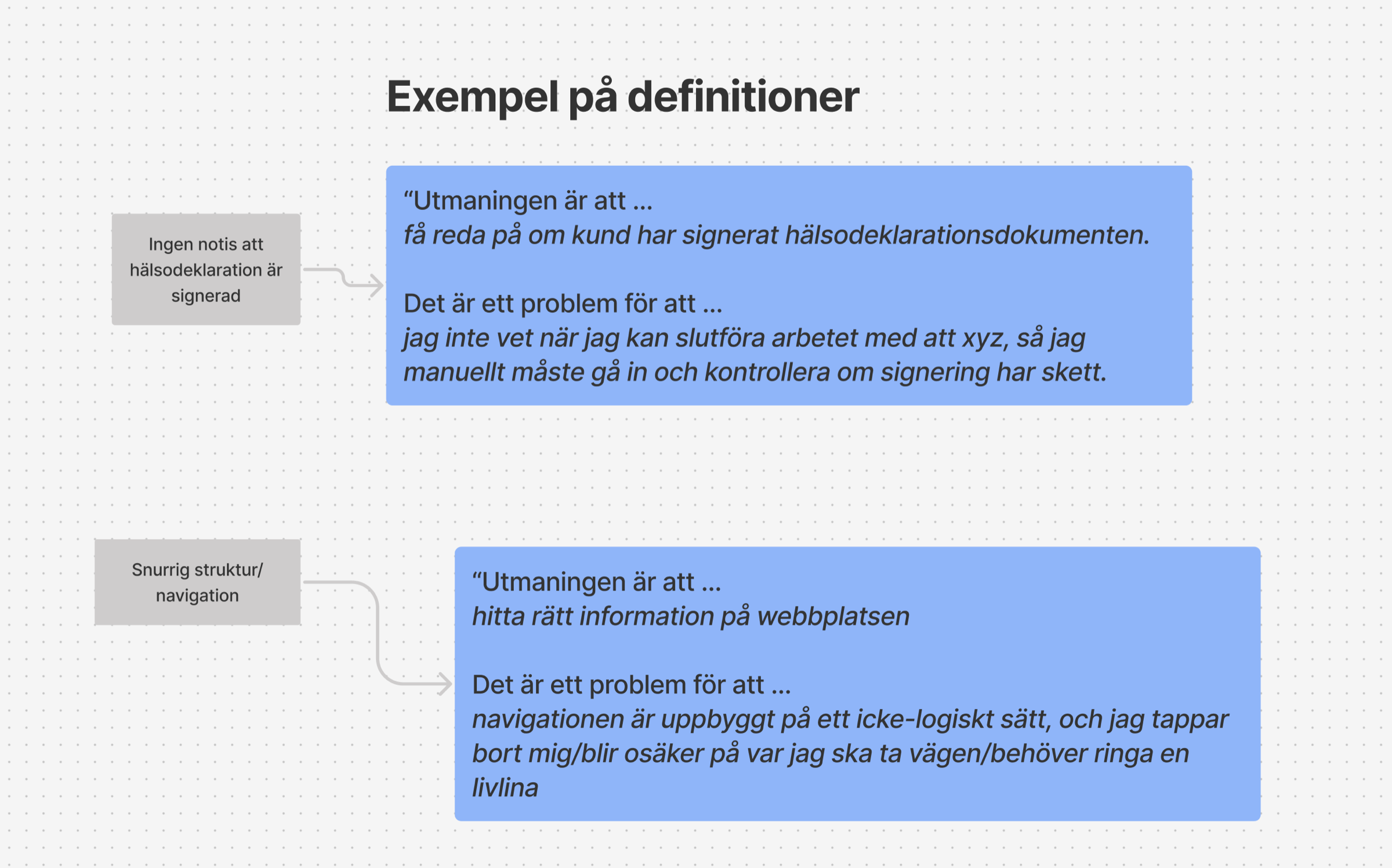
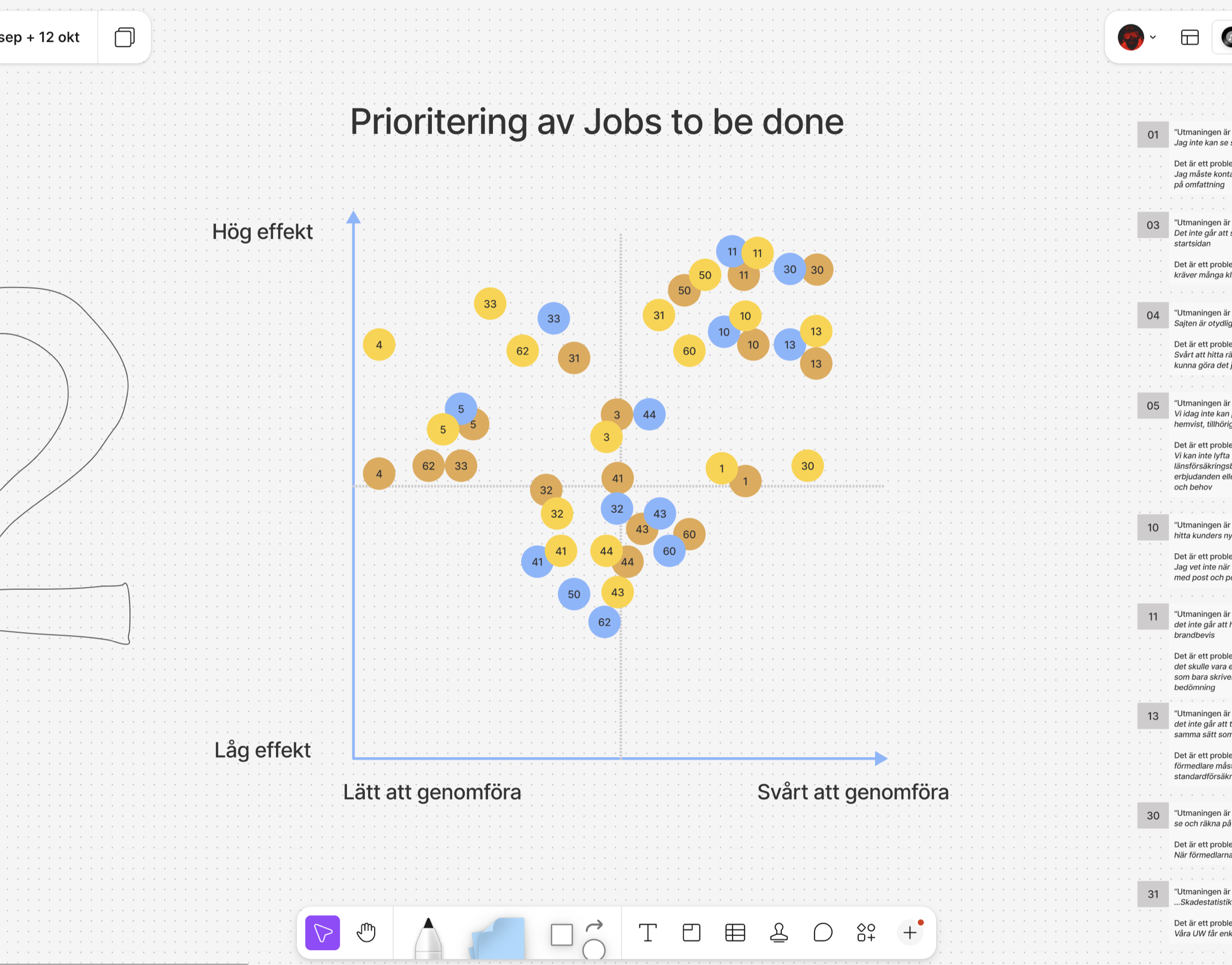
A fair way into the process I ran a couple of workshops with five or six people from both Försäkringsförmedling and external brokerage firms. Everyone described their own role and the challenge in their work, and from all those individual answers I could either confirm or reject my own thesis about how Förmedlarsidan should work.
An example of a sub-page
Liv, Hälsa & Sak — three business areas with sections in common, but with different content for the reader.
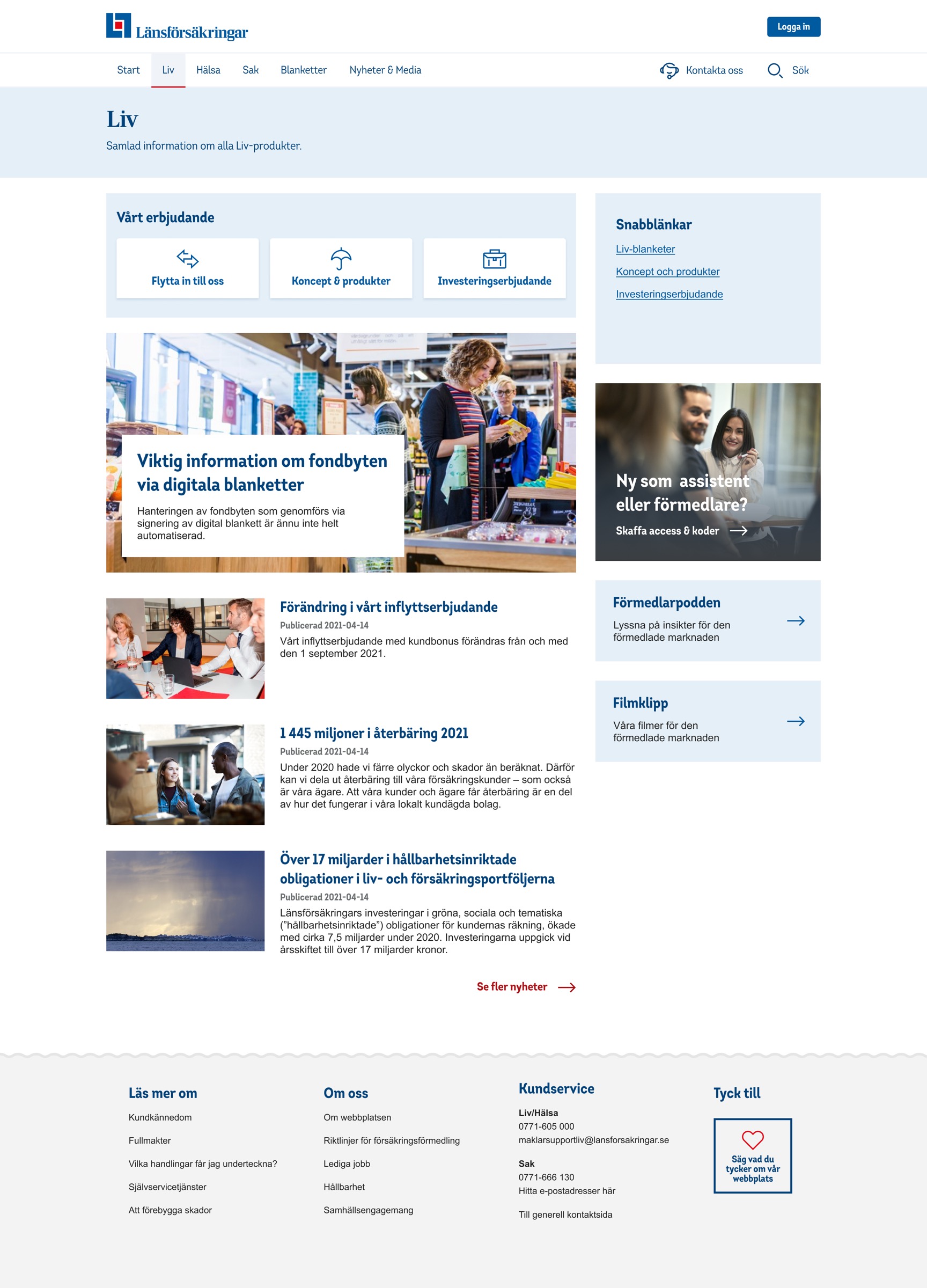
Launched long after I left the assignment.
My consulting assignment at Länsförsäkringar came to an end (sadly) during 2024 because of cuts to consultants, and much of the technical implementation of the broker website in particular hadn’t been done when I left LF. So I had little or no control over what finally shipped publicly, but in 2025 the new Förmedlarsidan did at least see the light of day.
(And yes, I can see things on the site that ought to be fixed)