Logotypes, visual identities and things that makes people recognize you.
I occasionally get asked to create various visual identities. Here are a few examples of previous work.
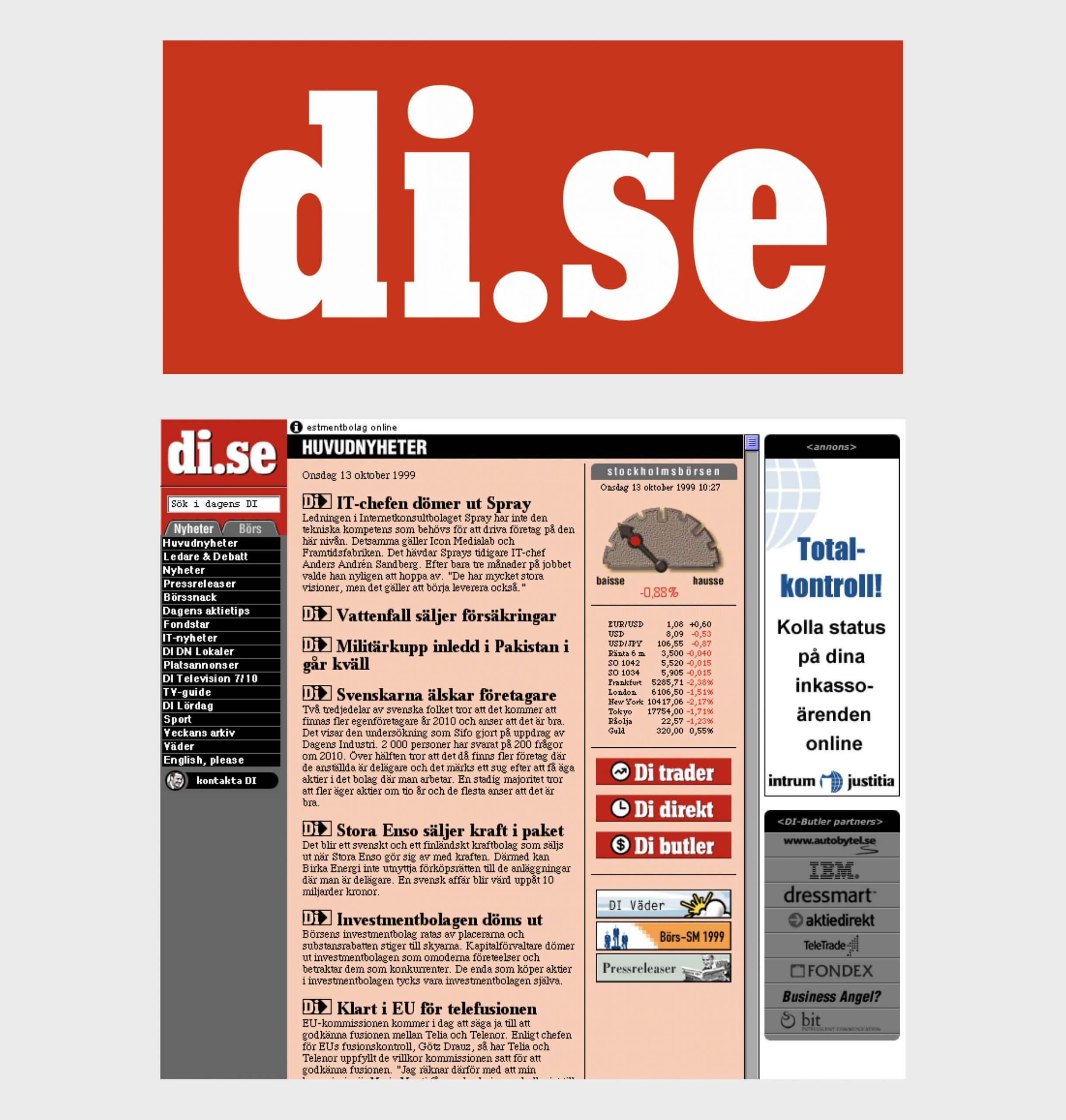
Logotype (and website + much more) for Dagens Industri
In 1998, I was asked to fly to Stockholm (from Gothenburg, where I lived at the time). The assignment was to design the website for Sweden's leading industry newspaper, Dagens Industri. While working on the project, I couldn't help mentioning that "the logotype might need a second look" (the one used looked more like a red Christmas decoration), and I was given the go-ahead to make a new logotype.
When asking around about the typeface Dagens Industri is using, I was pointed to a drawer with a set of sheets with Letraset letters, so … okay… off to dry-rub a couple of characters onto a piece of paper, then scan the image and finally vector-trace the letters in Macromedia FreeHand—quite a long way from today's digital design environment.

Apart from the logotype and website with its many sections, I also created most of the banners that Dagens Industri published. Below are a few examples of them (they make more sense if you understand Swedish).


Speaking of banners, I actually "invented" the banner format that — at least in Scandinavia — was called "Stortavla".
Back story: One day, I got a call from Dagens Industri's marketing chief, Sören Sunmo, telling me to "add some adverts on the blank space to the side of the site." He said, "I also want it to look like a French billboard."
What Sören was talking about can be compared to the current state of the Internet. Responsive web design was many years away from being a reality, and since we had designed the website to look good on a 14" screen, but many people used 16" screens with a resolution of around 1280 pixels in width, there was room to add content there.
So, I sat down and defined the 140x350 pixel dimensions for what would become the "Stortavla" (in traditional advertising, a "billboard" is translated to "stortavla" in Swedish). The first specification of the banner format was released on December 12, 1998. Soon after that, other newspapers in Sweden also wanted "the same big banner that di.se had", and it didn't take long until all production and ad agencies had to know all about this new format.

Visual identity for Forest management company Conifer Vision


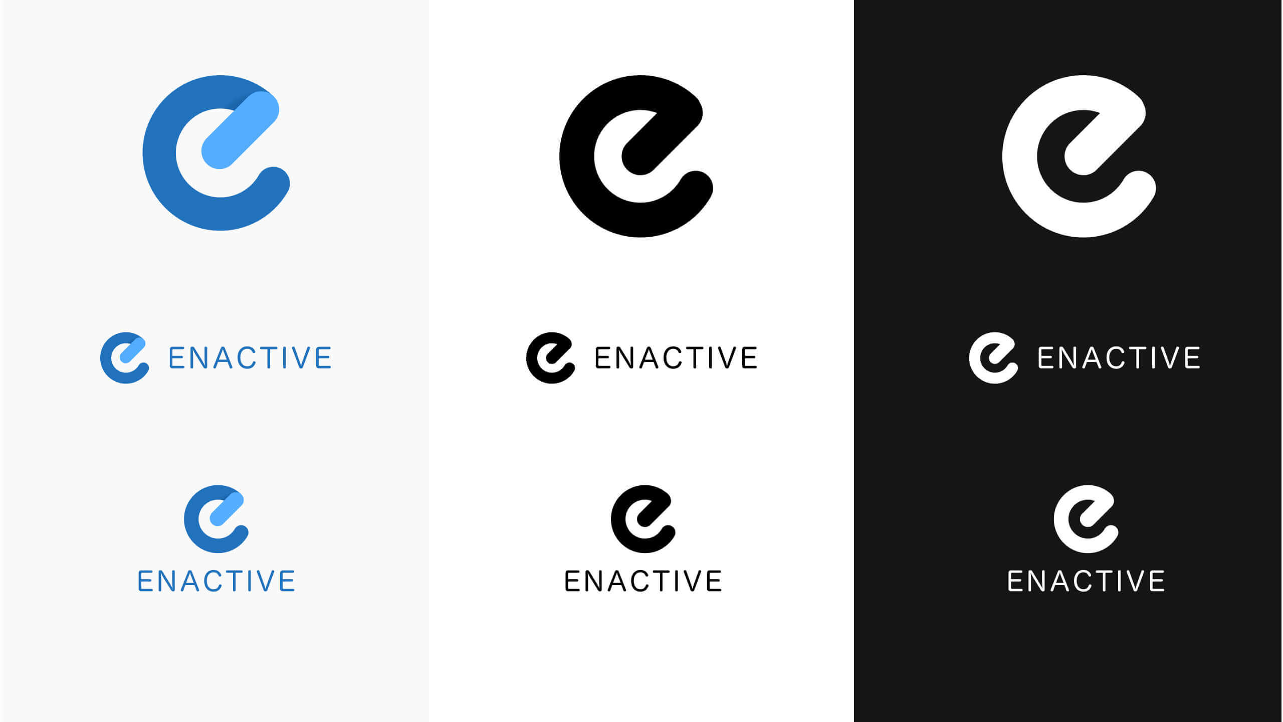
Visual identity for consultancy firm Enactive


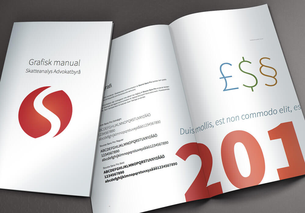
Visual identity for law firm Skatteanalys

Logotype & colour palette

Business card design

Brand manual

Logotype for travel agency "Bellitalia".
More things
Contact
Phone: +46 735 166610
Email: markus@blacktip.se
LinkedIn / Twitter / Dribbble / Figma /
© Blacktip 2011 – 2026
👋🏻 ttyl