Thirteen smaller projects, spanning 1998 to 2017. Banners, newsletters, brand identities, site overhauls, a Sharepoint system that never shipped, and a banner format that ended up in a Wikipedia article. Not every project deserves its own page — but each of these taught me something.
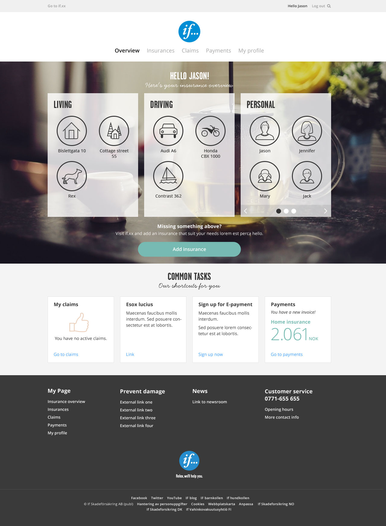
In 1998, I was asked to fly from Gothenburg — where I lived at the time — to Stockholm. The assignment was to design the website for Sweden's leading industry newspaper, Dagens Industri.
While working on the project, I couldn't help mentioning that "the logotype might need a second look" — the one they used looked more like a red Christmas decoration than a newspaper mark — and I was given the go-ahead to make a new one.
When I asked around about what typeface Dagens Industri was using, I was pointed to a drawer with a set of sheets of Letraset letters. So — okay — off to dry-rub a couple of characters onto a piece of paper, then scan the image, then vector-trace the letters in Macromedia FreeHand. Quite a long way from today's digital design environment.
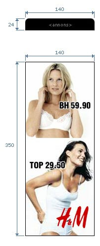
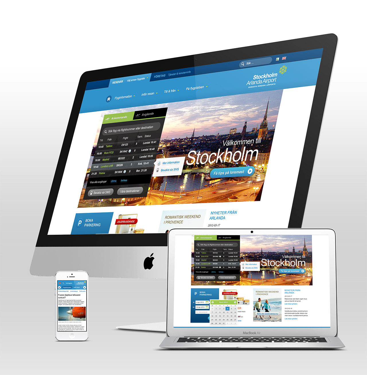
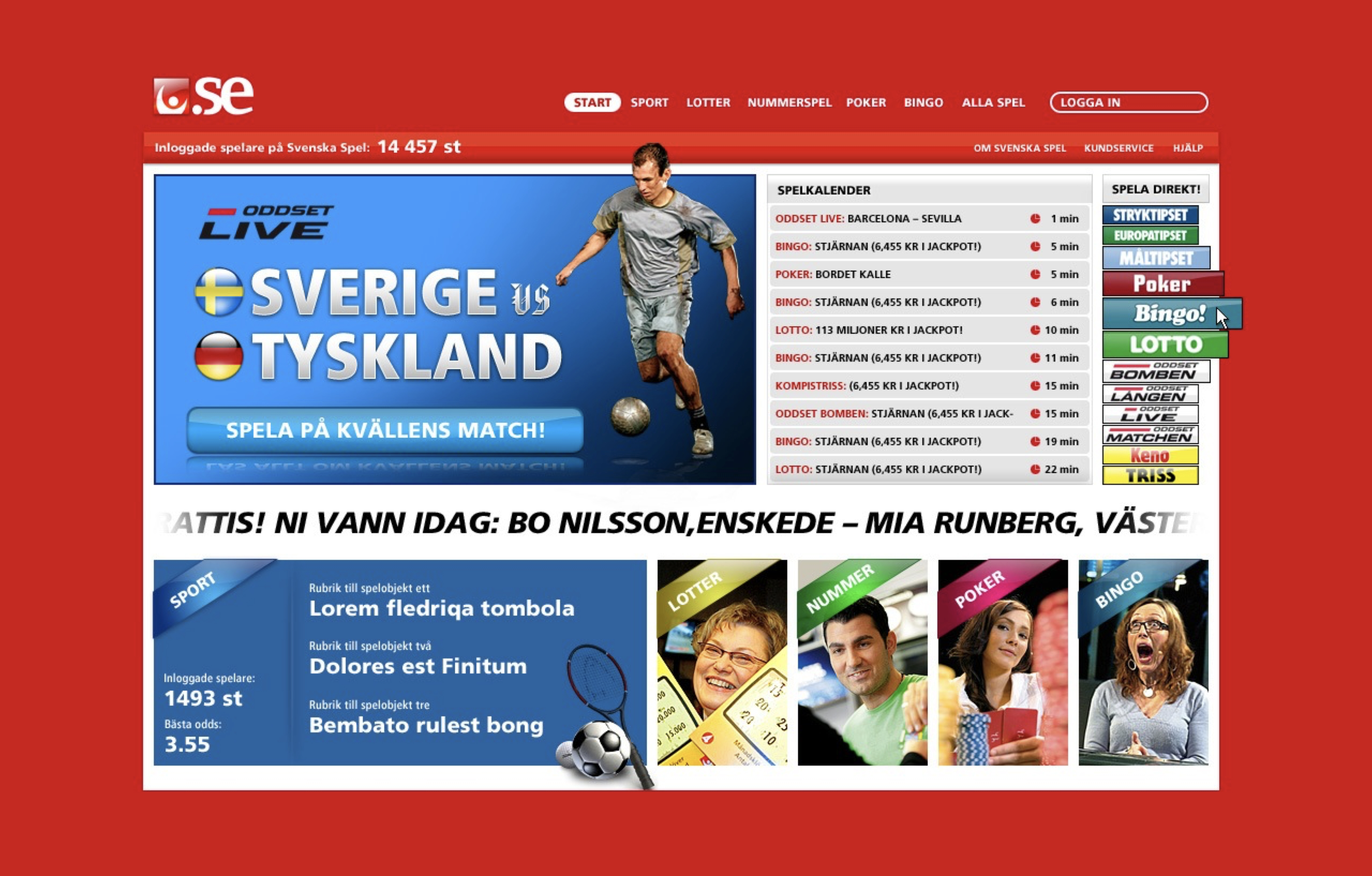
Speaking of banners — I actually invented the banner format that, at least in Scandinavia, came to be called Stortavla.
Back story: one day, I got a call from Dagens Industri's marketing chief, Sören Sunmo, telling me to "add some adverts on the blank space to the side of the site." He said — "I also want it to look like a French billboard."
What Sören was talking about can be compared to the current state of the internet. Responsive web design was many years away from being a reality, and since we had designed the website to look good on a 14" screen, but many people used 16" screens with a resolution of around 1280 pixels, there was room to add content on the side.
So I sat down and defined the 140 × 350 pixel dimensions for what would become the "Stortavla" (in Swedish advertising, a billboard is translated to stortavla). The first specification of the banner format was released on December 12, 1998. Soon after, other newspapers in Sweden also wanted "the same big banner that di.se had," and it didn't take long until all production and ad agencies had to know all about this new format.
In 2017, I was part of a team on a quest to build a Sharepoint system to handle all the documents that a large Swedish ISP needed to manage within its organisation.
The system never got released — to my knowledge, anyway. Probably due to things that occasionally happen in large organisations.


Another design that never saw the light of day — a website for Scania to build collaboration among truckers.
Designed with the editorial bones of a proper newsroom: big hero lead, clean typography, room for video and long-form reporting alongside quick updates.

Design and structure for a Swedish food supplier. I also defined rules on how the company should present various groceries across its websites, and designed the checkout flow when purchasing goods.


A campaign and site pitch for one of Europe's largest energy companies — part of a broader brand refresh. Clean, Caring, Confident: three attributes, three treatments, one brand.

A redesign of the customer overview for Nordic insurance company If — the page where a policyholder lands when they sign in and need to do something: check coverage, file a claim, pay a bill.
Wireframed in Axure RP 7.0, then designed and delivered.

Swedavia runs ten of Sweden's airports — Arlanda, Bromma, Landvetter, Malmö, Luleå, Umeå, Visby and the rest. I designed all of their individual airport sites. Ten brands under one parent, each with its own flavour but held together by a shared system.

Work on Gant's digital presence — the main site and a series of seasonal newsletters in the brand's heritage sportswear voice. Sprezzatura, a winter nautical edition, portraits from Yale.

Visual identity for consultancy firm Enactive. A mark built around conversation — two brackets enclosing a stroke. Tested across signage, merchandise, and collateral.

Svenska Spel is one of the largest online betting companies in Sweden. I've designed many campaigns and banners, as well as many of the online games. Below is one of the screens I could find in an old archive.

Visual identity for law firm Skatteanalys — a departure from the navy-blue-and-grey norm of the category. Warm reds and oranges, a £/$/§ motif, a full brand manual, and the business card to match.
The identity extended into a website — built to the same warm palette and carrying the same considered tone. Still live at skatteanalys.se.
I was tasked with redesigning the website for one of the largest sports retail companies. Initially, my team and I wanted the site to have a black theme — and I remember going to a presentation with a large Apple monitor to make sure the black design was presented the way I intended.
Eventually, we opted for a white version of the website.

Identity and website for Time Advokatbyrå — a law firm that wanted a mark that didn't feel like every other firm in the category. Black, serif, hourglass-adjacent.


